Color Strategy
Creative Direction: Amy Kim, Stina Sawdust
Photography: Heidi Bohnenkamp
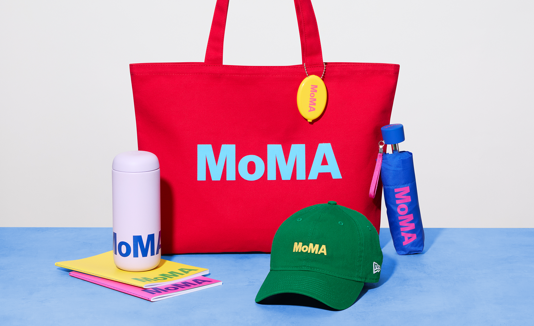
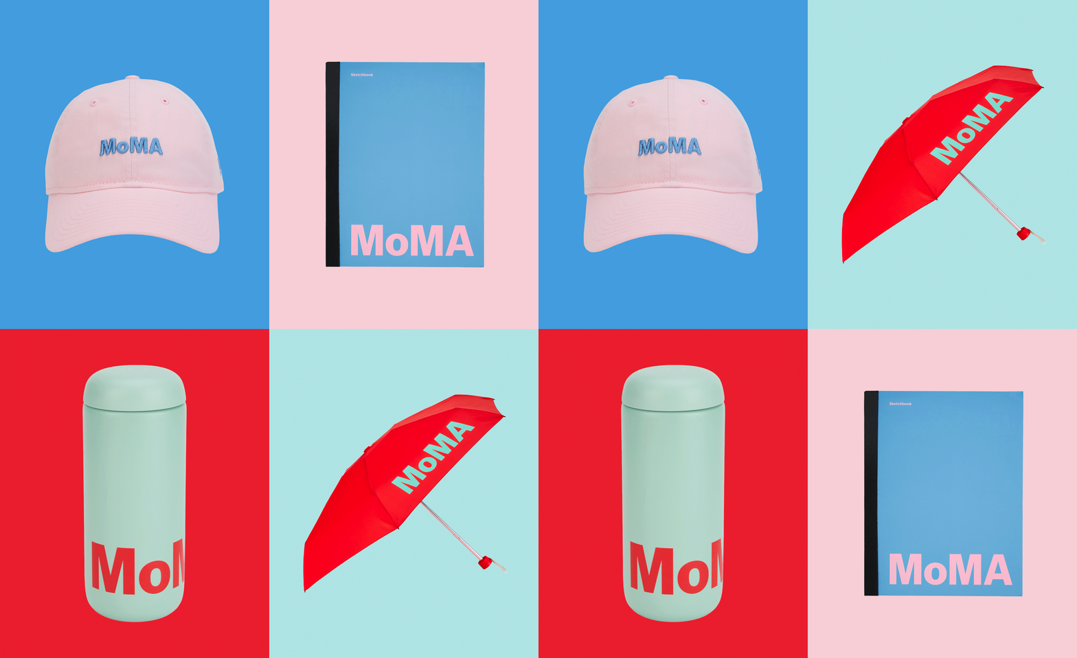
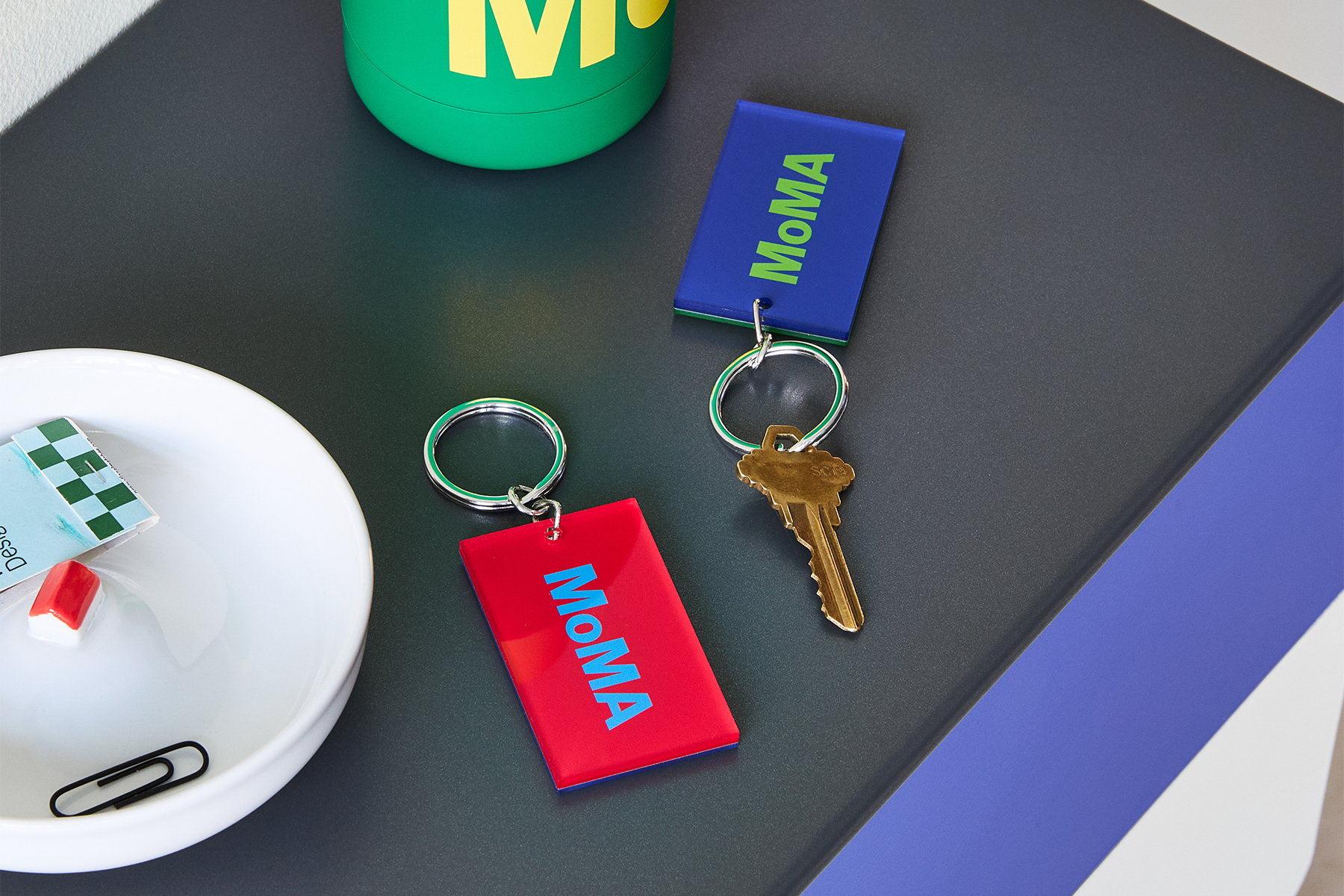
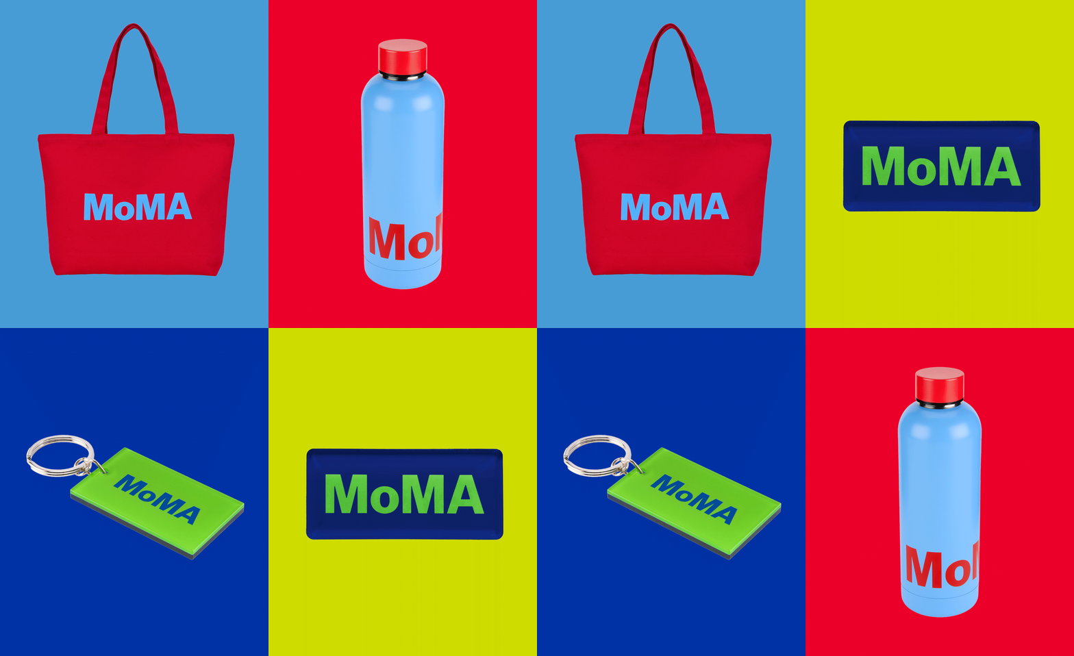
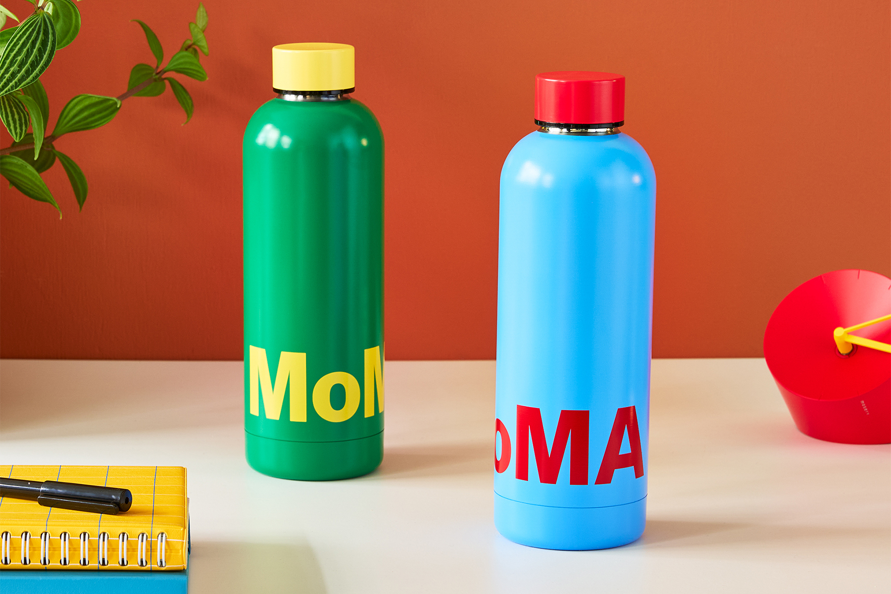
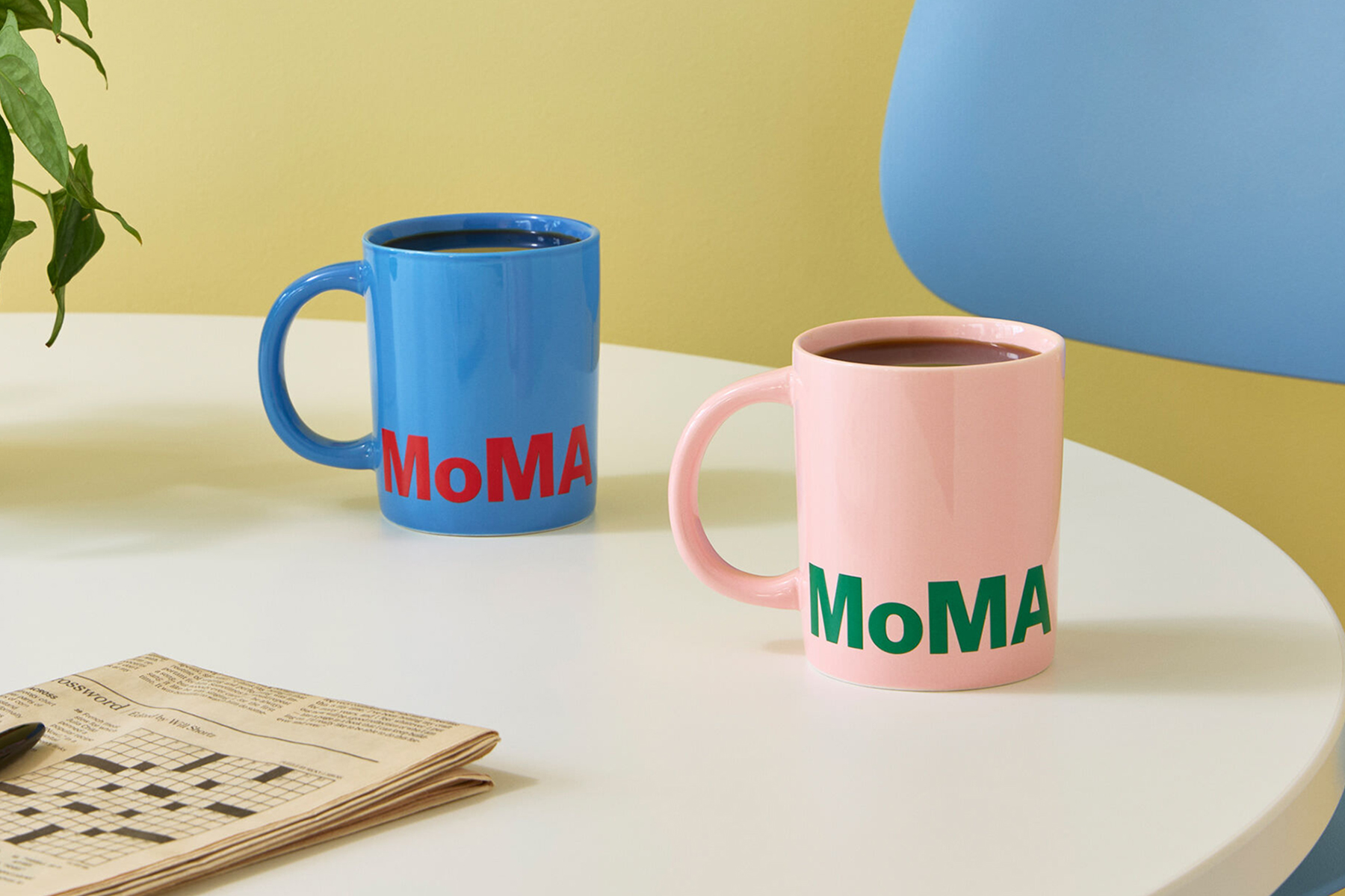
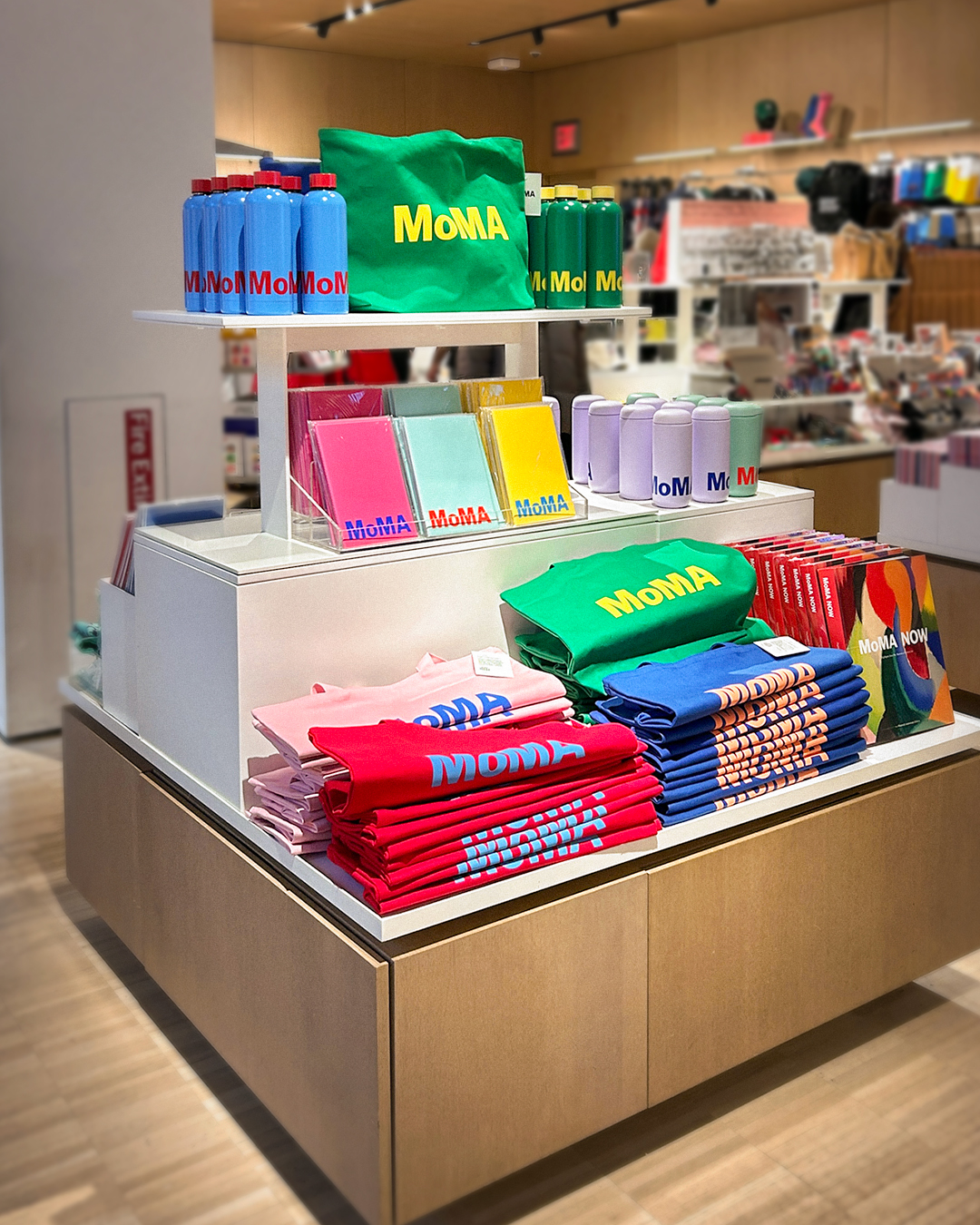
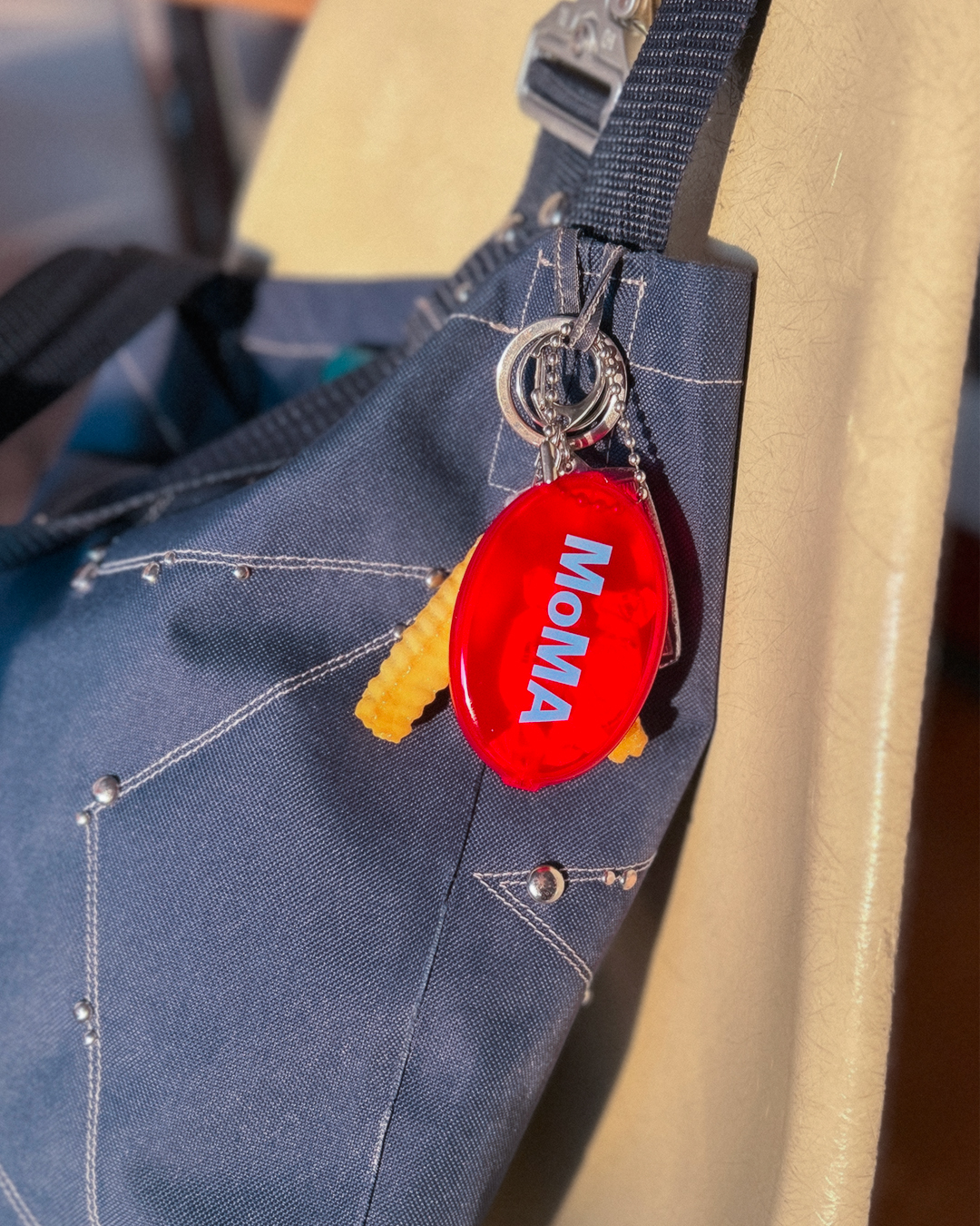
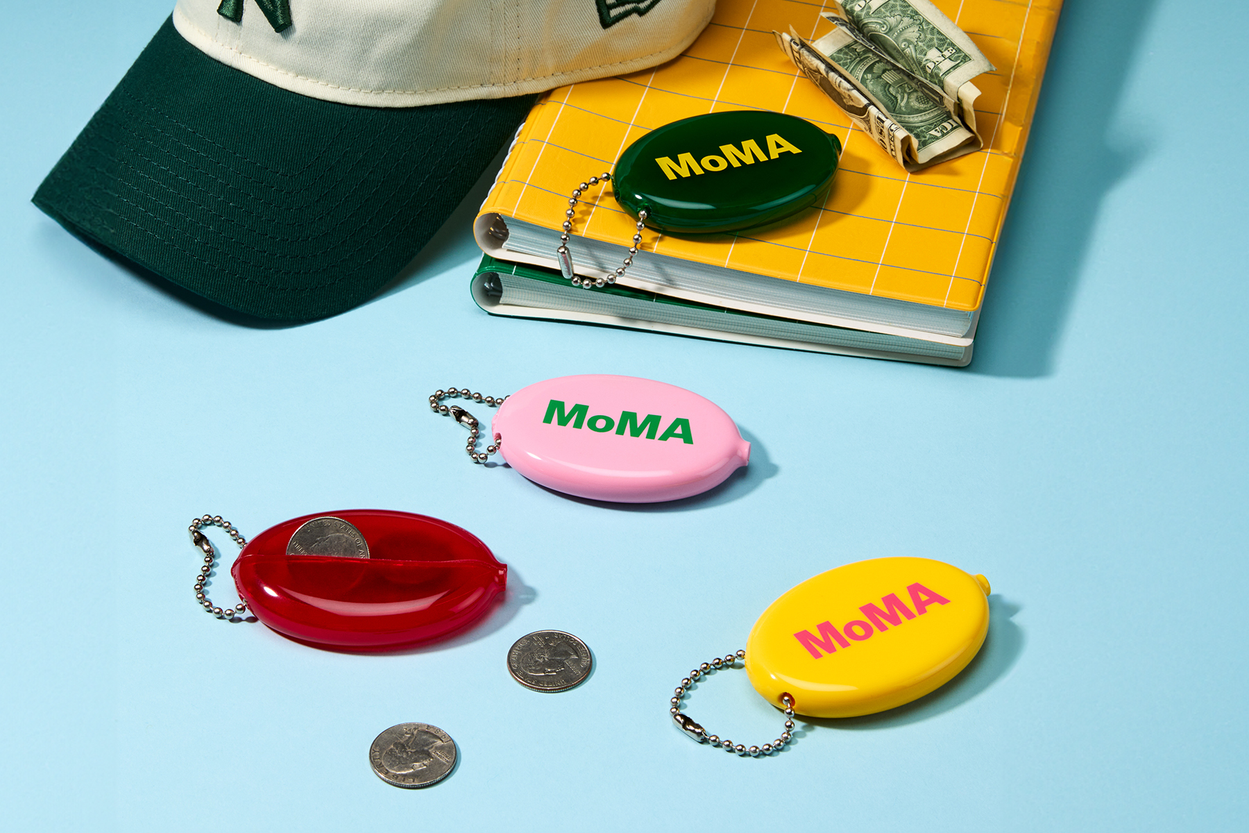
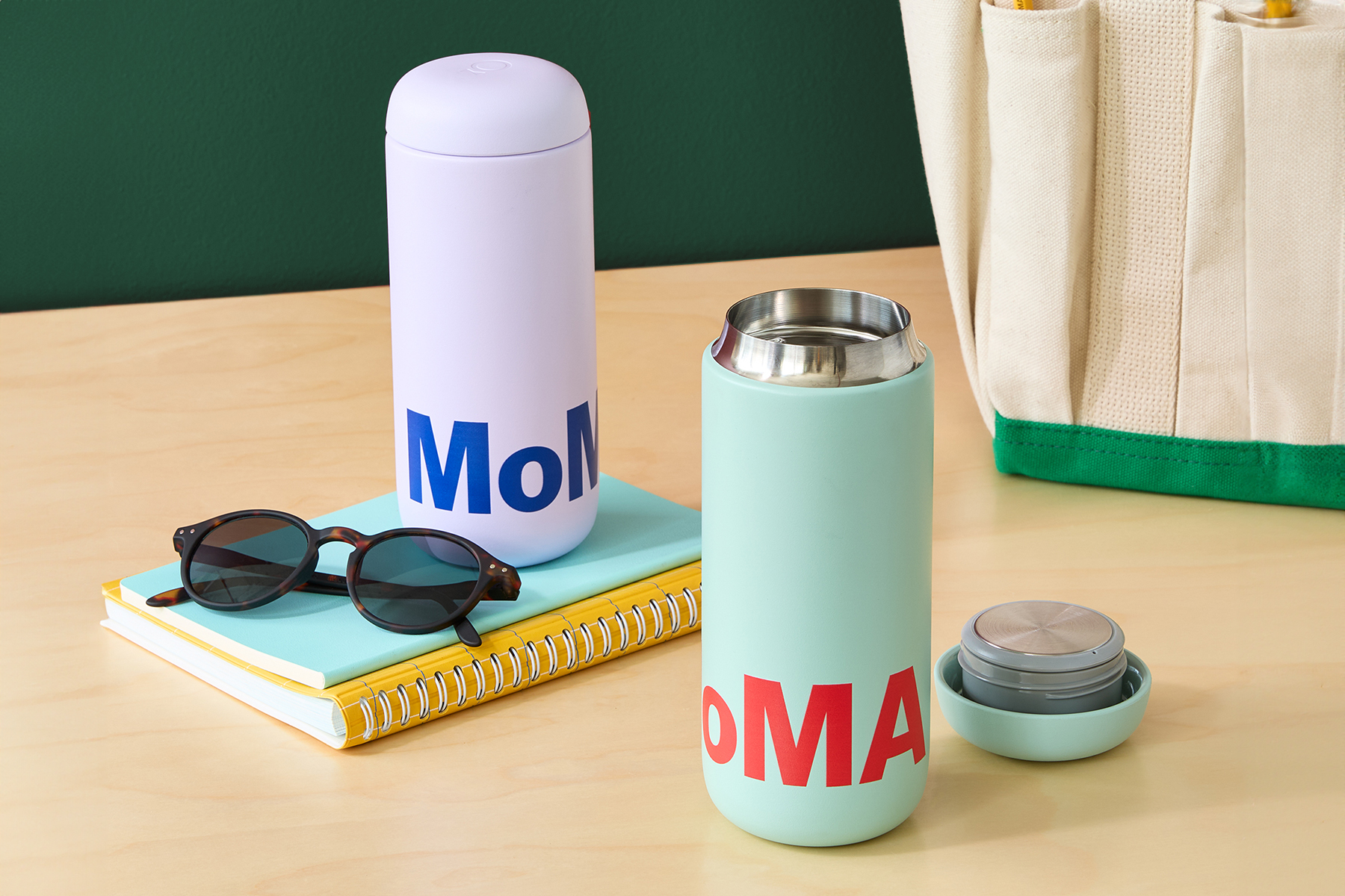
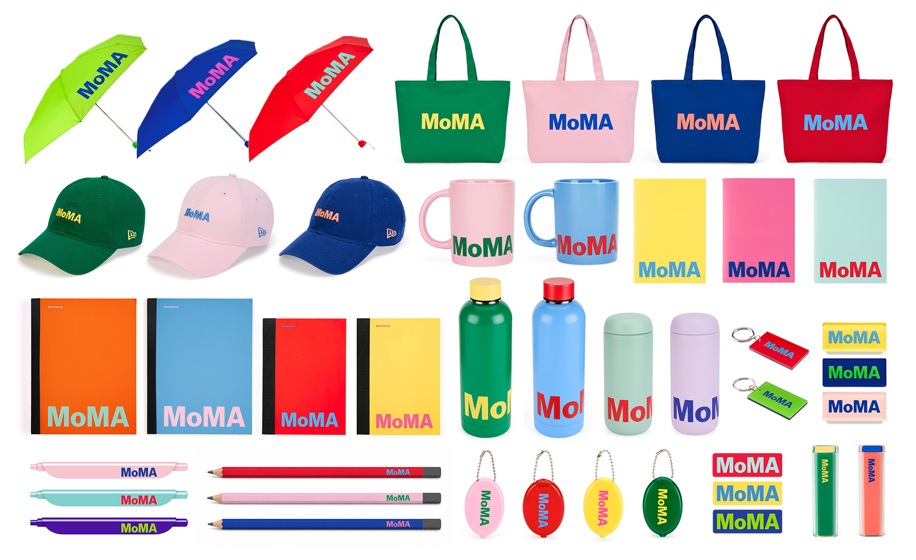
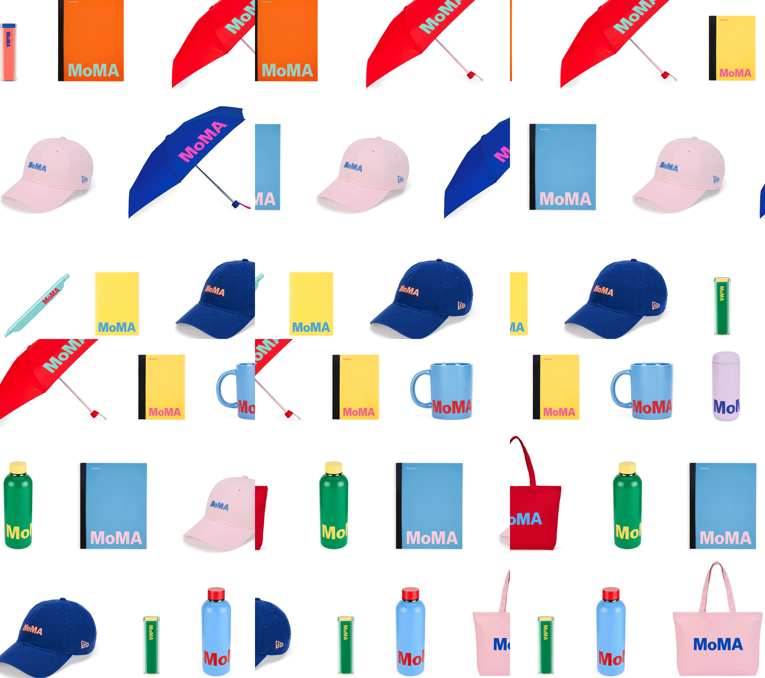
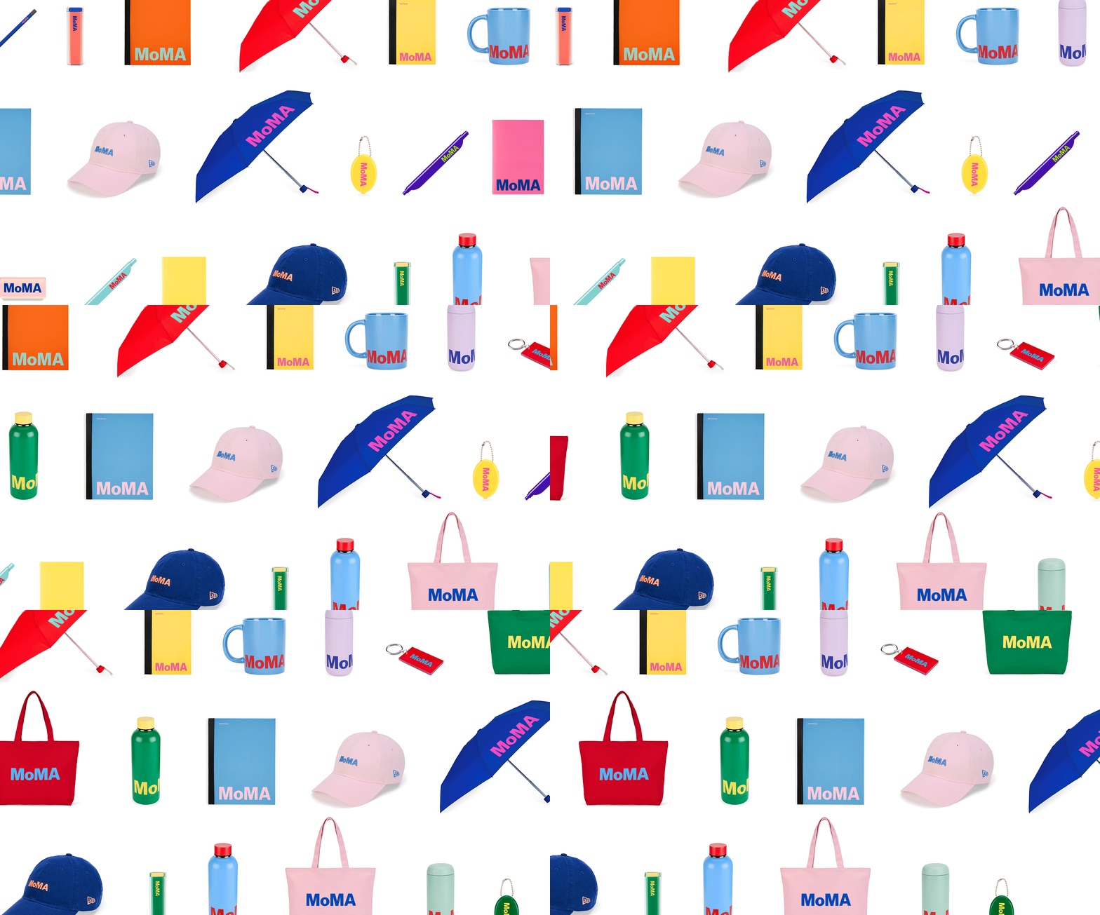
For the first time since MoMA's 2019 Colorblock Logo program, the MoMA Colorful Logo Collection reimagined the brand's iconic logo merchandise across 43 products, introducing several new product categories.
I refined the brand color palette and developed the collection's color strategy, creating a scalable color system that balanced MoMA's iconic visual identity with a fresh, contemporary expression. Every color pairing was carefully refined to achieve bold contrast, visual harmony, and a cohesive experience across the collection.
2019年のColorblock Logo Program以来となる、MoMAロゴグッズの新たなデザインプロジェクト、「MoMA Colorful Logo Collection」。既存商品のデザインを刷新するとともに、MoMAとして初めて展開する新しい商品カテゴリーを含む、全43商品のコレクションをデザインしました。
ブランドのカラーパレットを見直し、コレクション全体のカラー戦略を設計。MoMAらしいアイコニックな世界観を保ちながら、新鮮で現代的な印象を生み出すカラーシステムを構築しました。また、すべての配色を一つひとつ丁寧に調整し、力強いコントラストと美しい調和、そしてコレクション全体の一体感を実現しました。