Art direction, visual identity, collateral design
Photo: Heidi Bohnenkamp
Styling: Kayla Austefjord
Retouching: Michael Pina
Store visuals with: Danya Li
Creative direction: Kelly Clawson
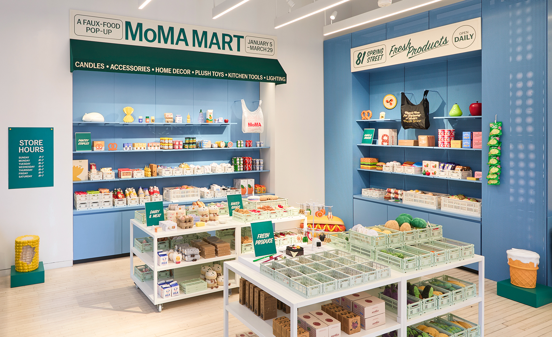
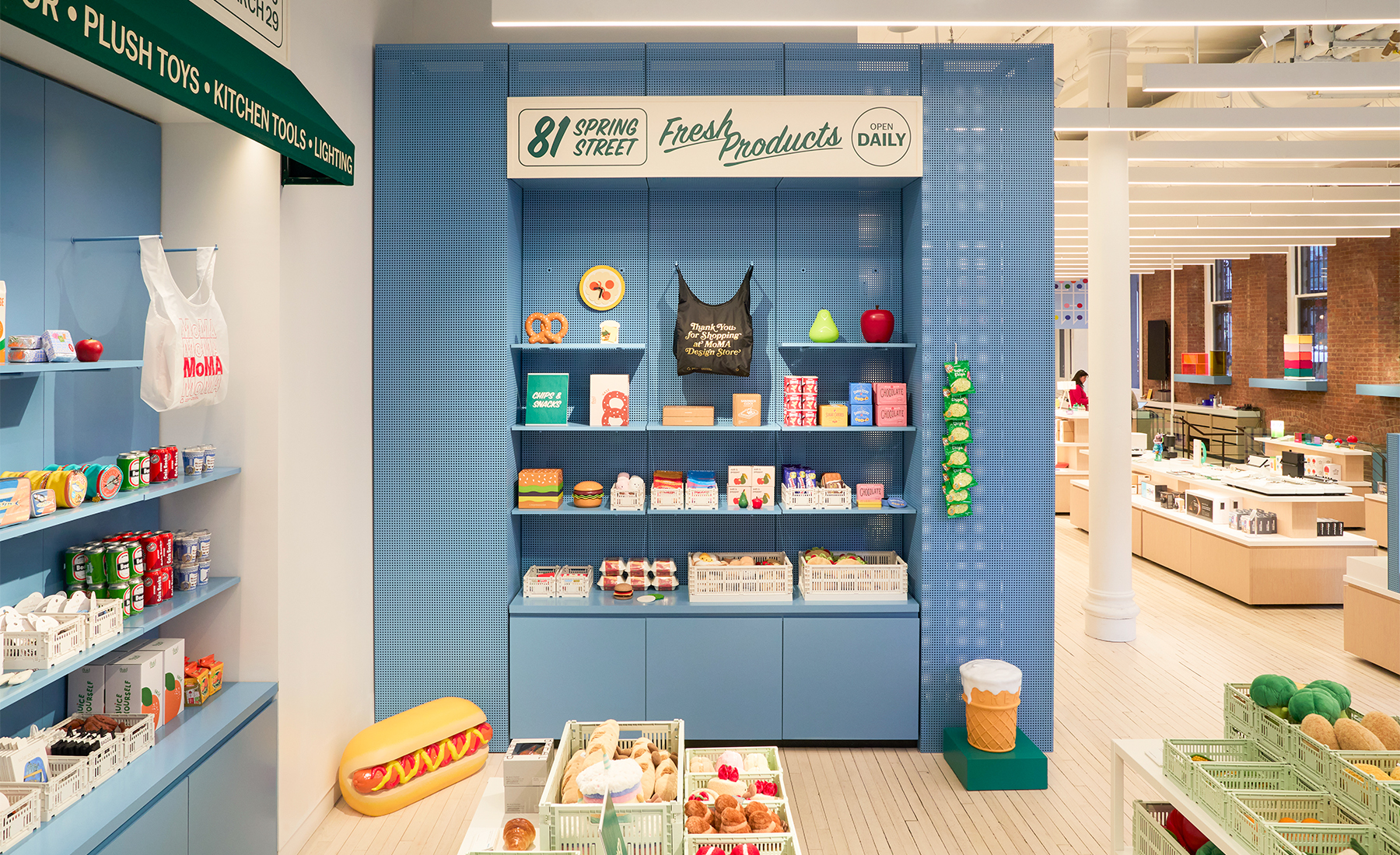
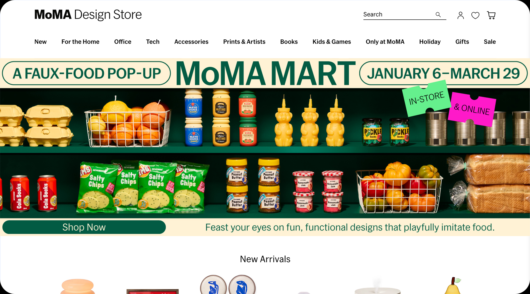
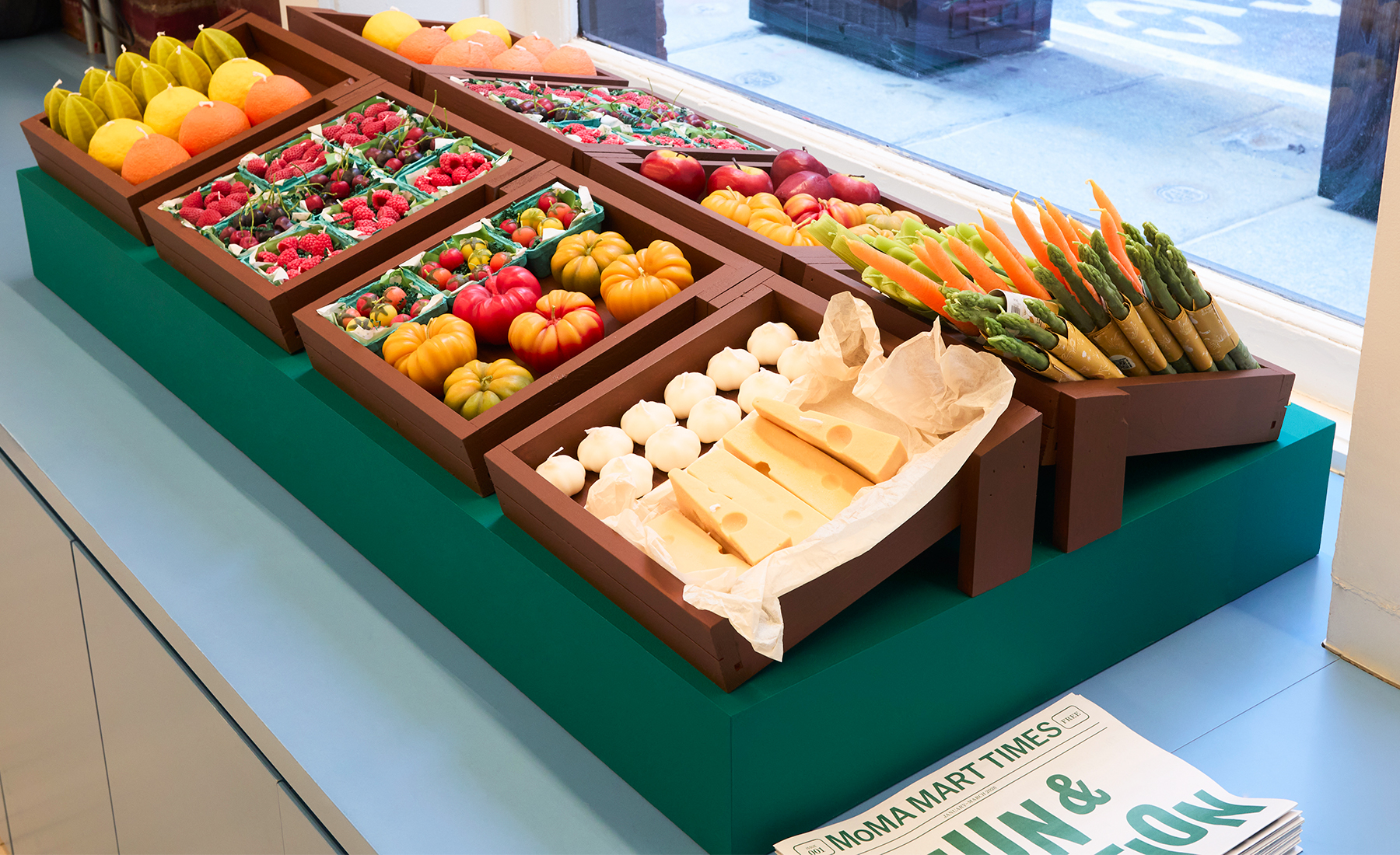
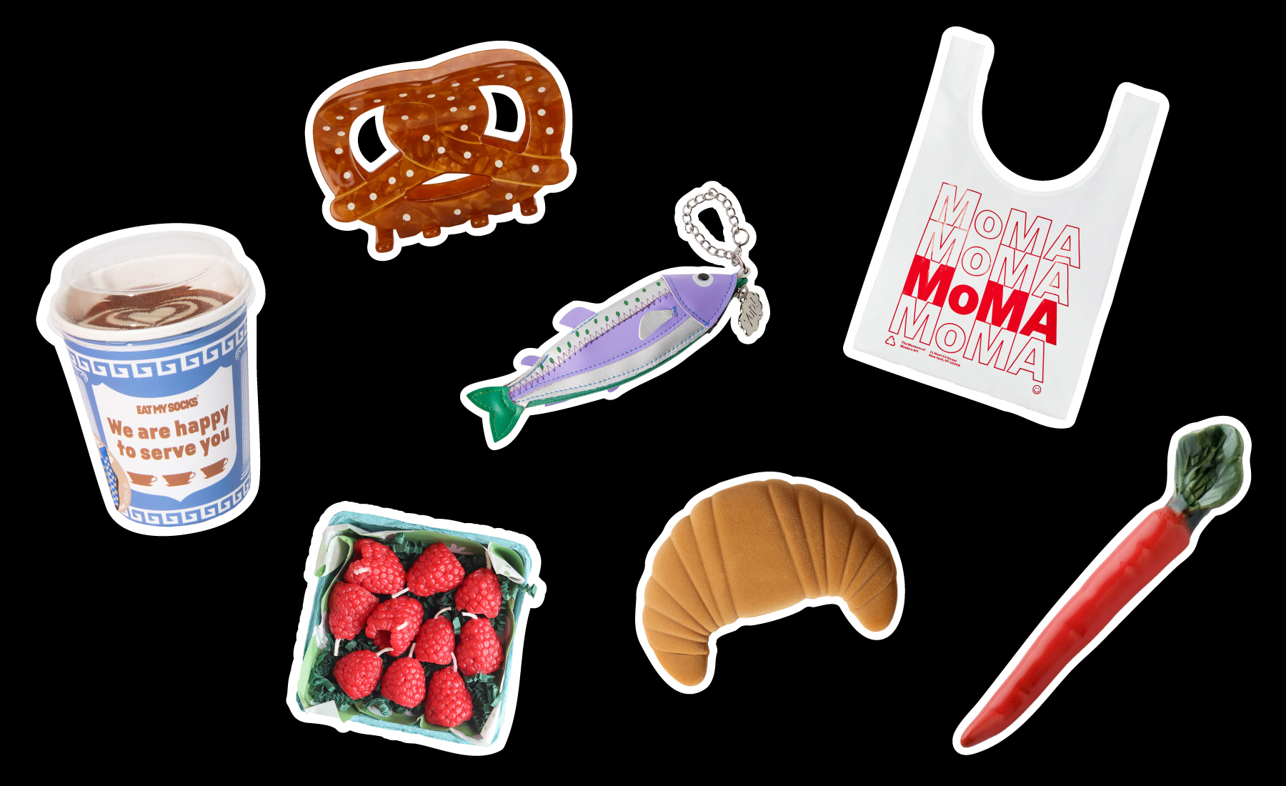
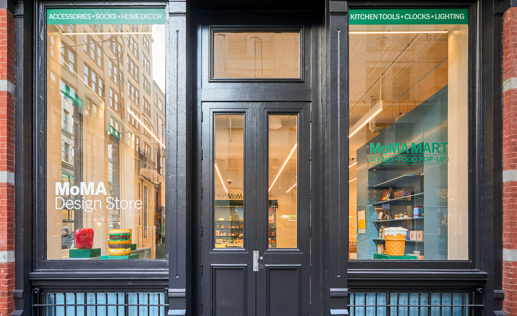
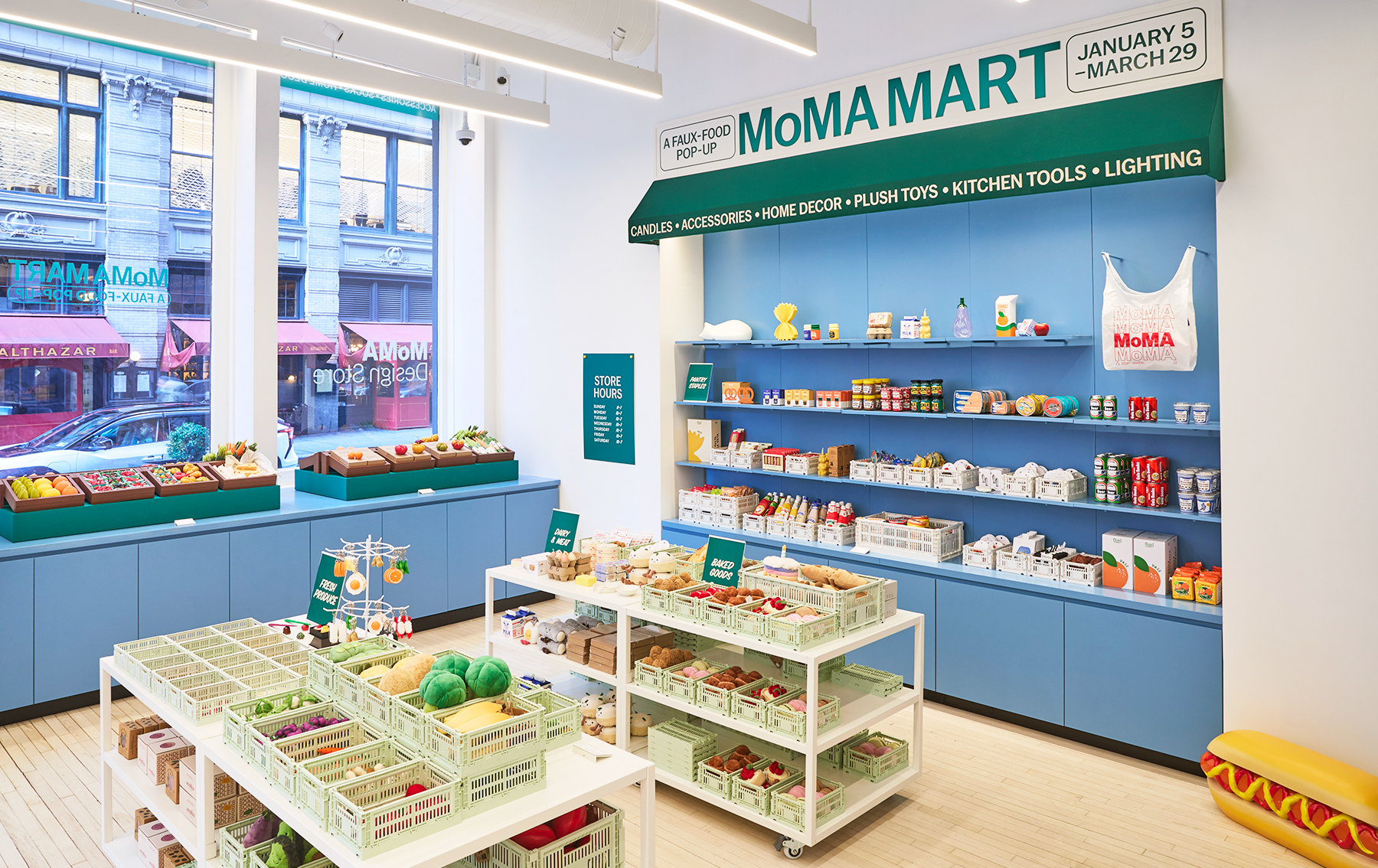
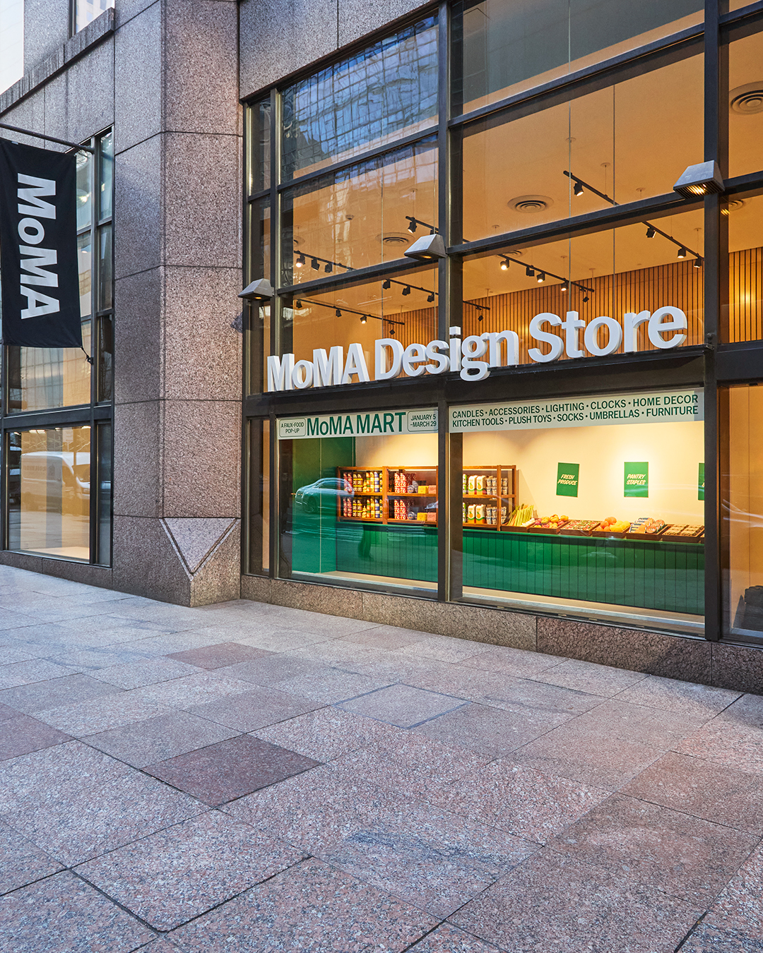
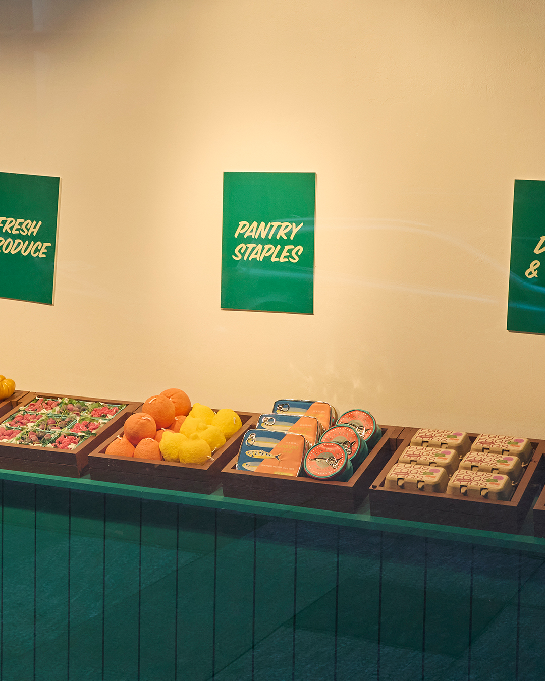
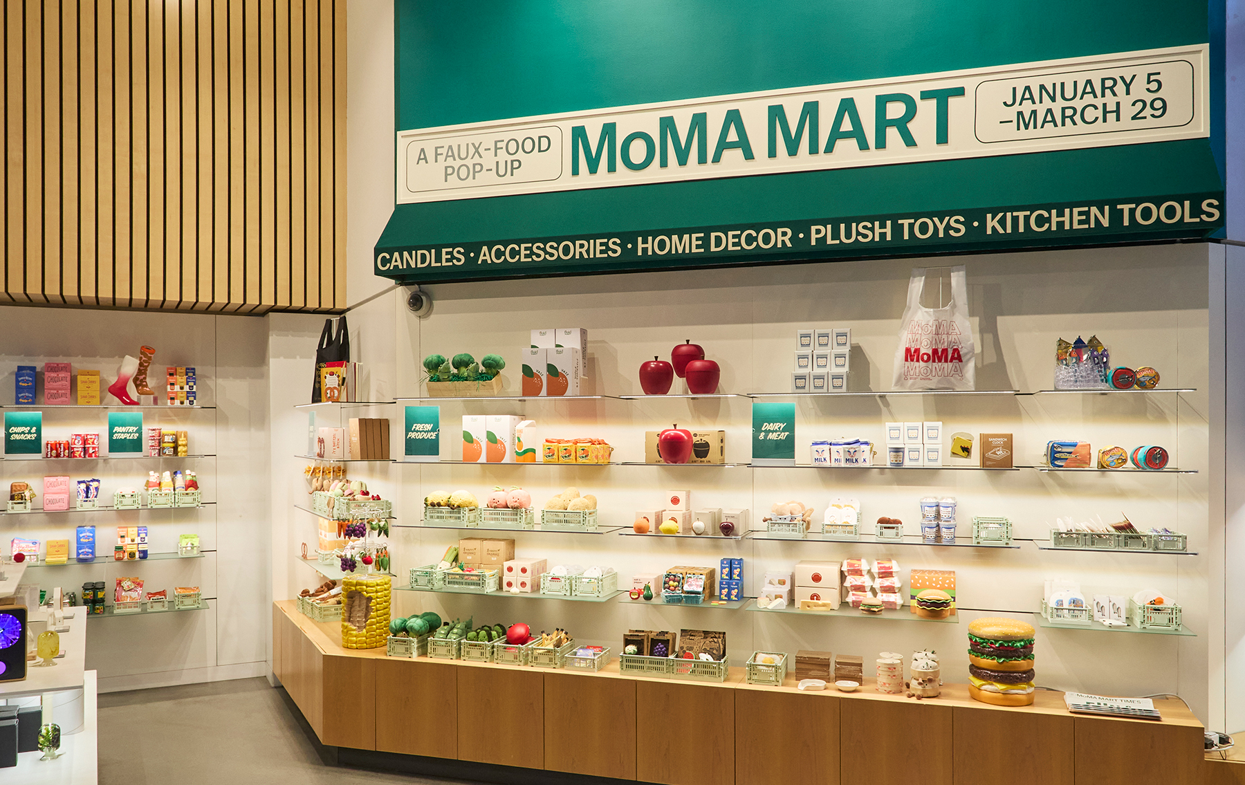
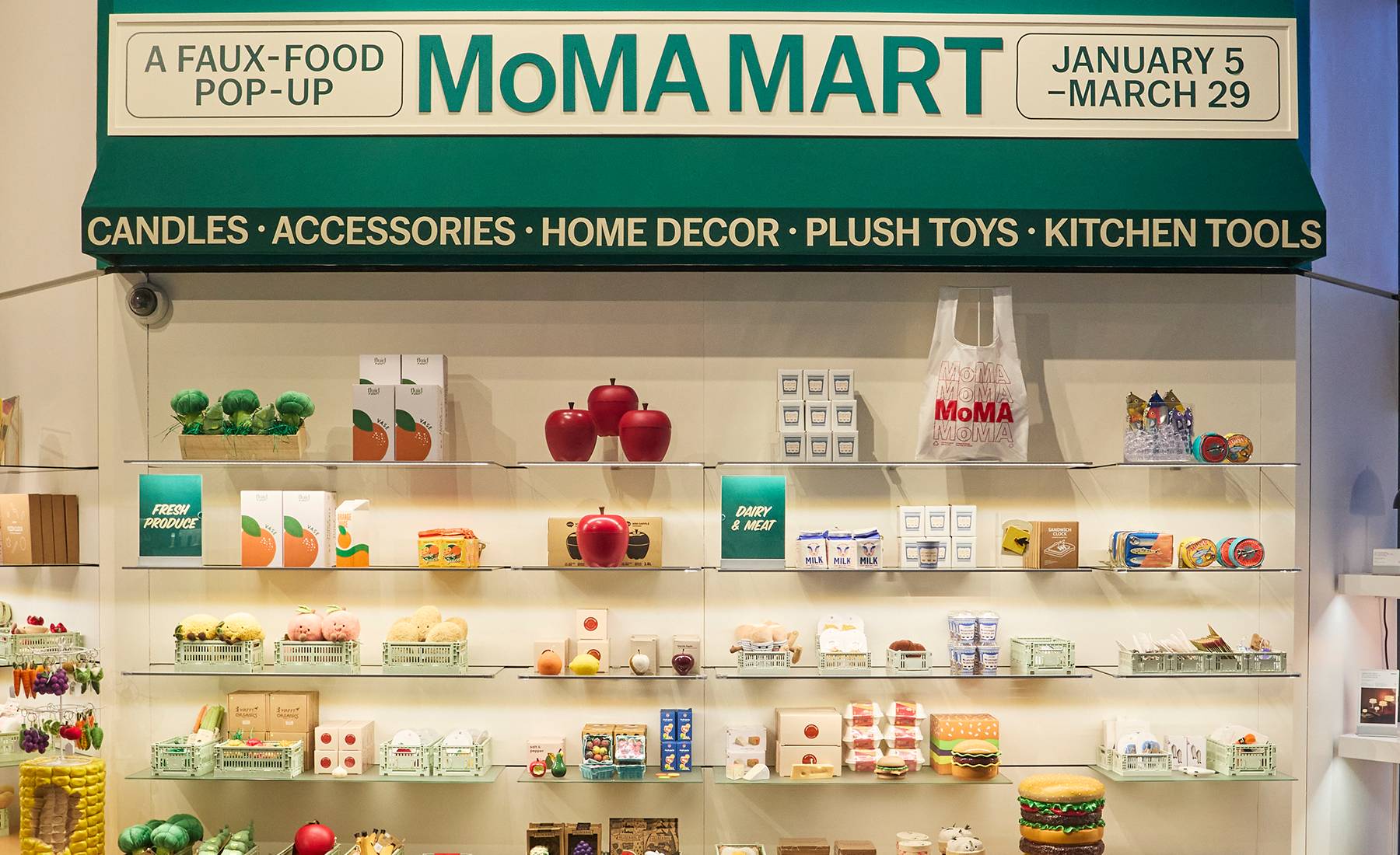
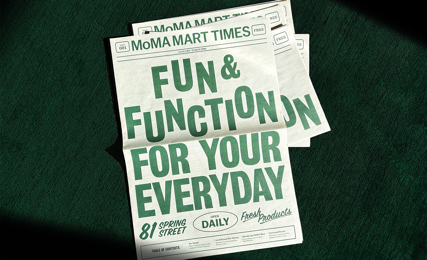
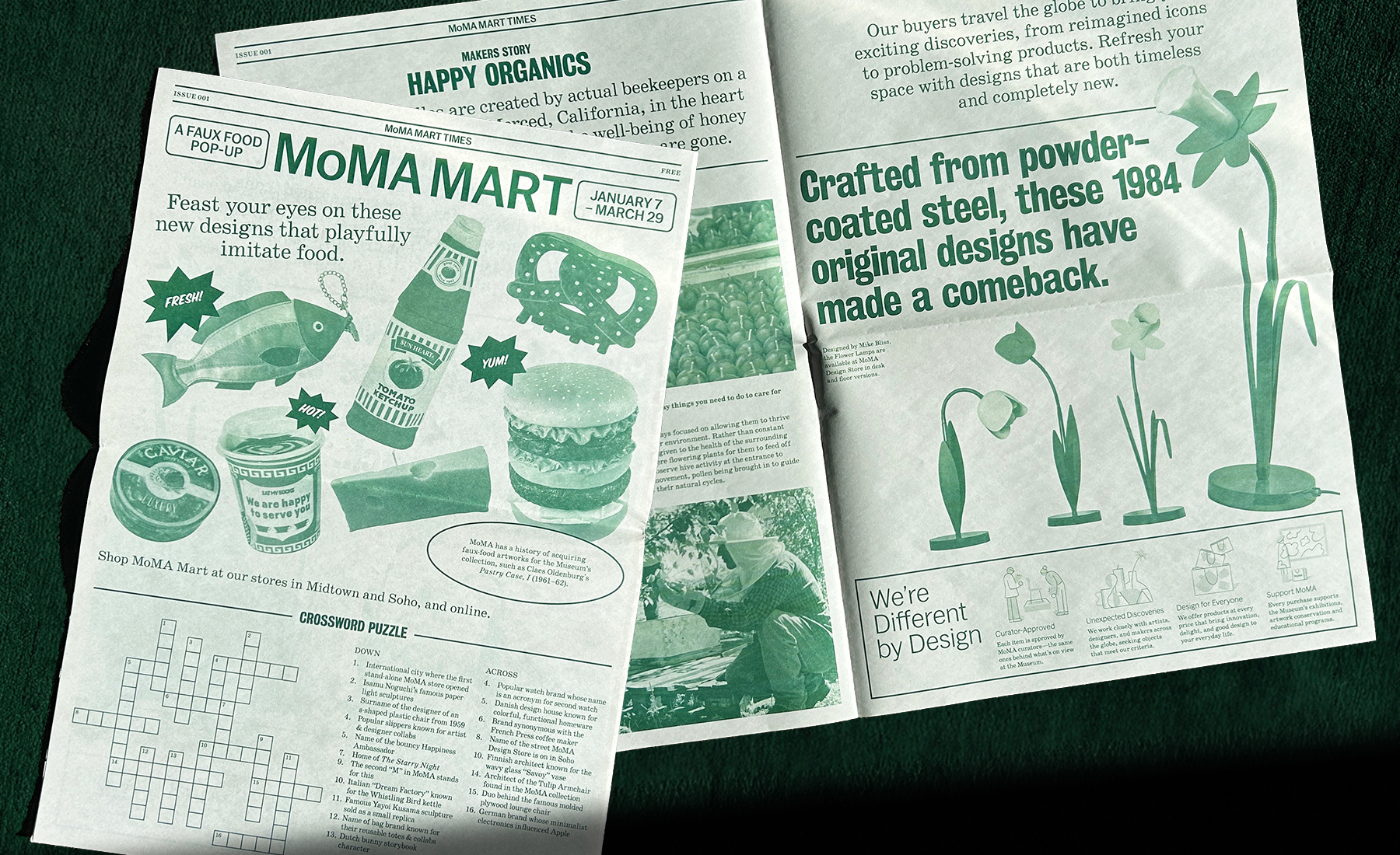
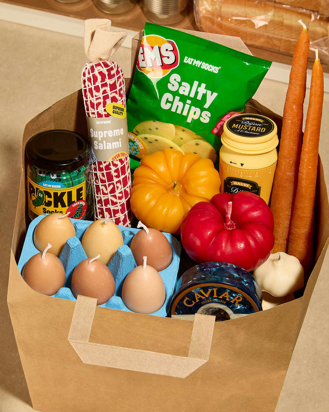
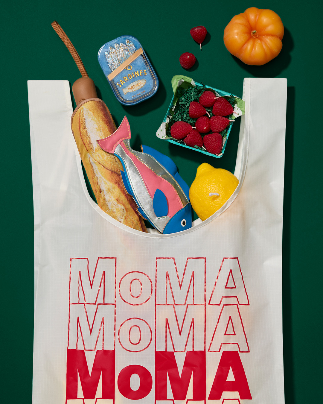
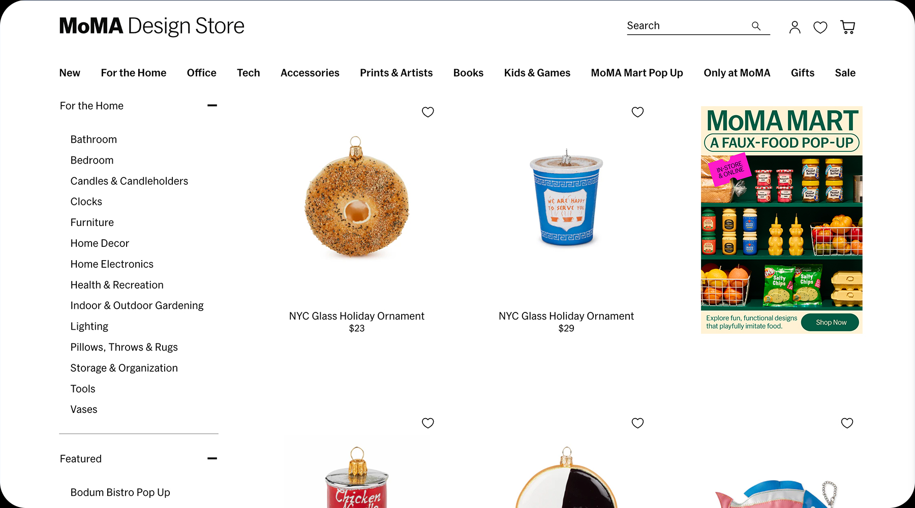
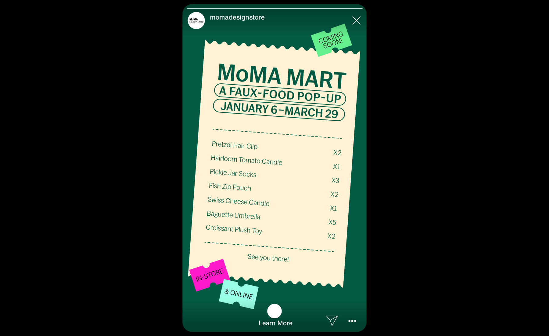
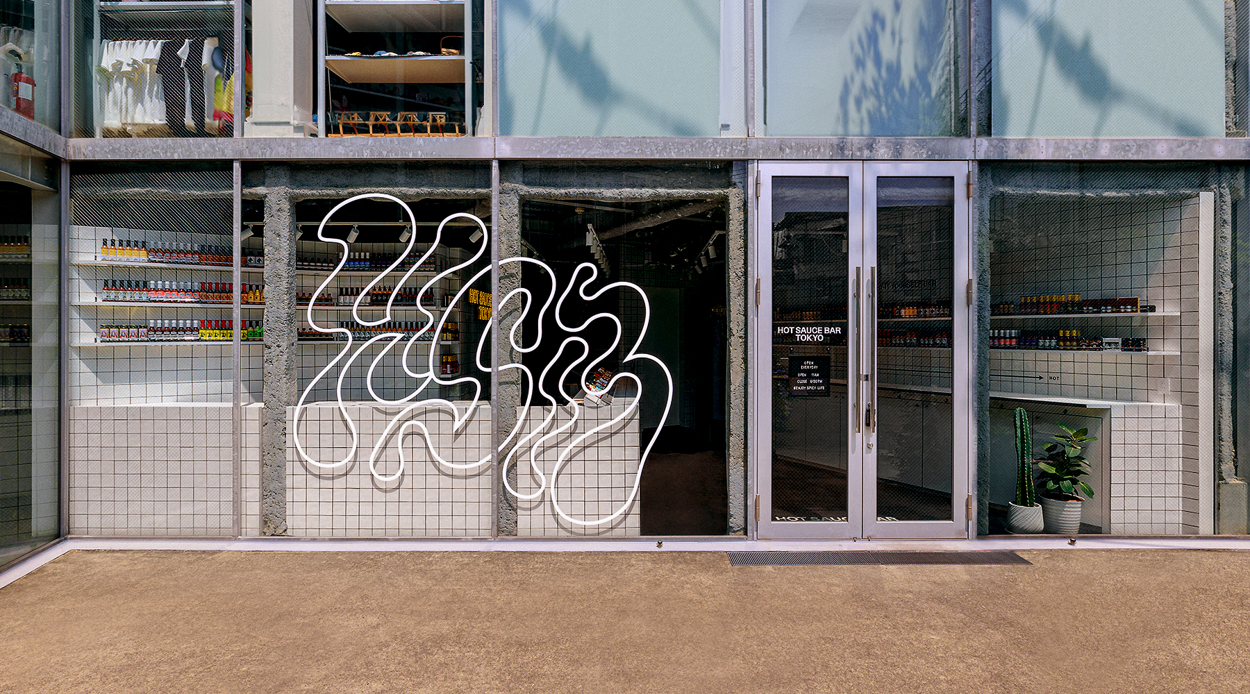
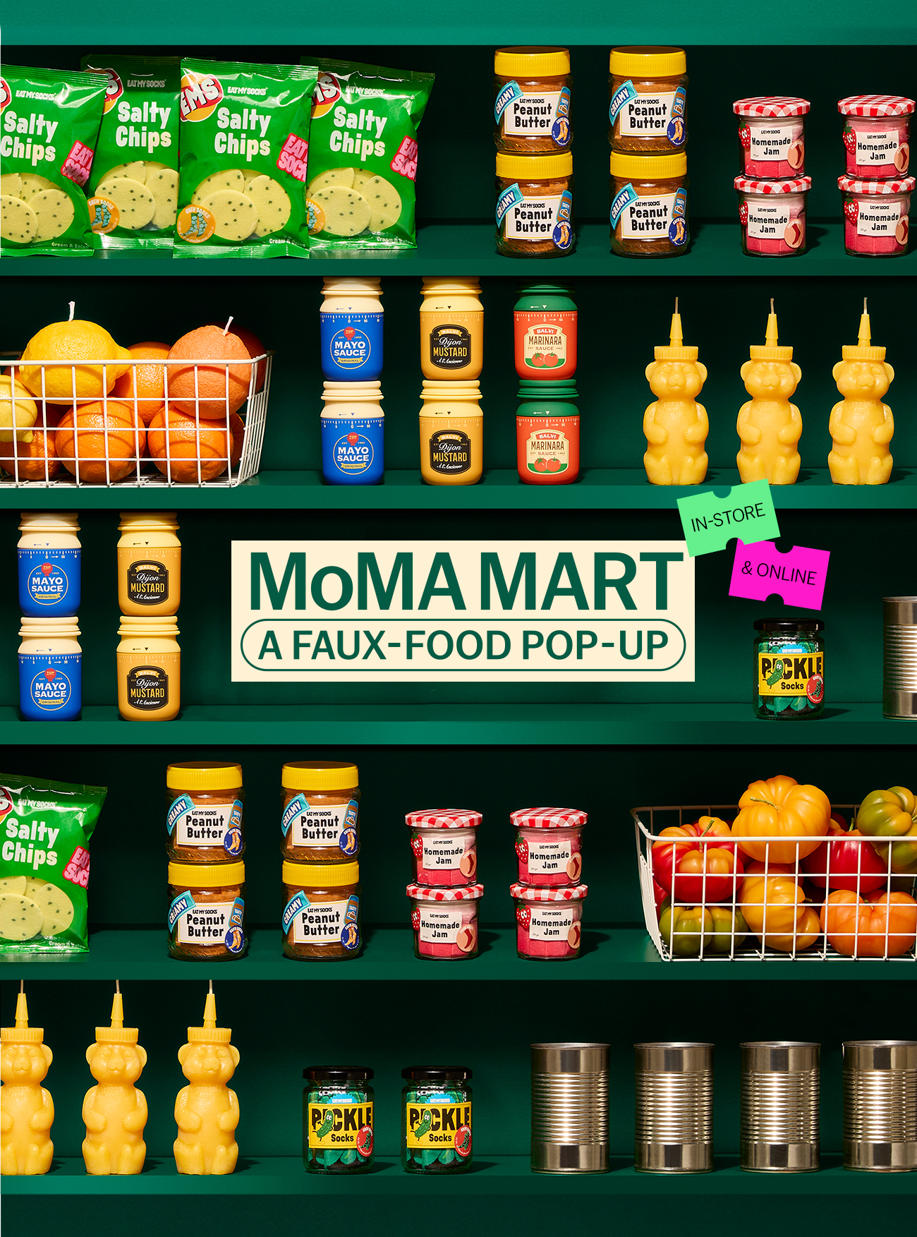
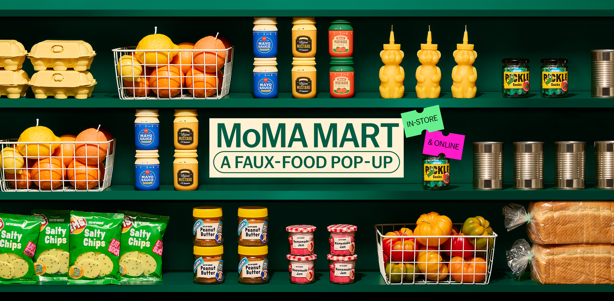
MoMA Mart was a pop-up store experience by MoMA Design Store, conceived as a reimagined neighborhood grocery store stocked entirely with design-driven faux-food items—everyday objects transformed into sculptural, humorous forms. For this project, I led the visual identity development and art direction, shaping how the pop-up translated familiar supermarket culture into a distinctly MoMA experience rooted in New York City.
Inspired by NYC’s iconic bodegas, the visual system drew from bold, utilitarian typography and neighborhood signage, refined into a more considered and contemporary expression. The color palette moved away from typical bodega chaos, anchoring the system in a deep, restrained green to create an elevated and sophisticated visual presence aligned with MoMA’s brand language.
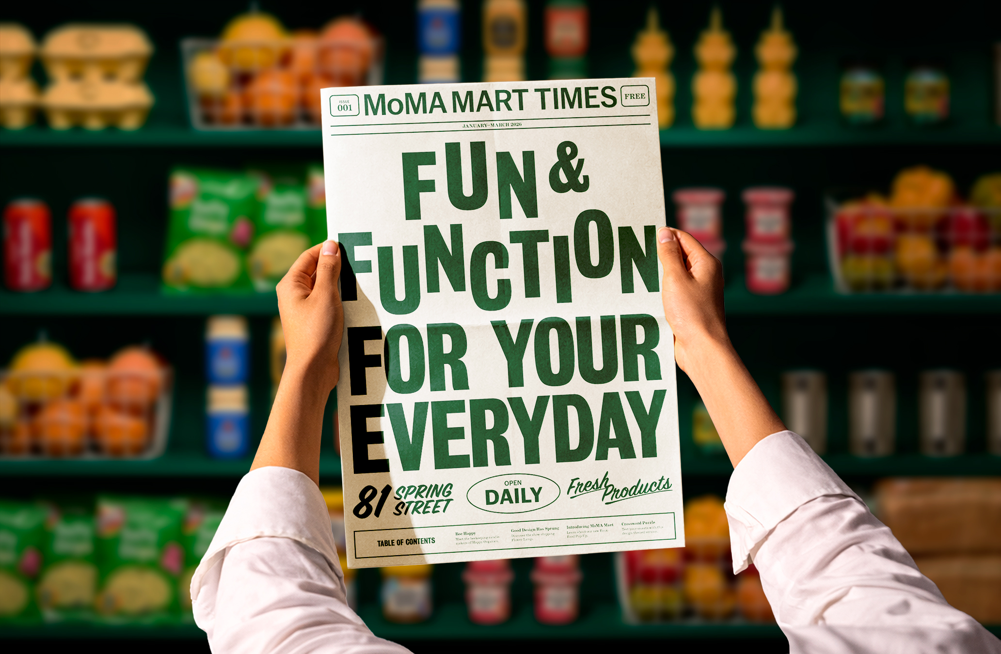
This identity extended across all touchpoints—from environmental graphics and in-store signage to print and digital assets, including a free take-away newspaper designed to invite visitors to pause, browse, and engage. Familiar retail cues were reinterpreted into a cohesive typographic and graphic system, balancing humor and boldness with warmth and approachability while maintaining a distinctly MoMA-forward aesthetic.
MoMA Mart は、MoMA Design Storeによる期間限定のポップアップ型ストア体験で、一見すると食品のように見えるデザインや日常アイテムを販売する空間として展開されました。本プロジェクトでは、ビジュアルアイデンティティの開発およびアートディレクションを担当し、この大胆なビジュアルジョークをニューヨークらしさを備えたMoMAならではの体験へと昇華させました。
NYCの象徴的なボデガ(街の生活に根付いた小規模食料品店)から着想を得たビジュアルシステムは、実用的で力強いタイポグラフィや街のサイネージを参照しながら、より洗練された現代的な表現へと再構築しています。配色はボデガ特有の雑多な印象からあえて距離を取り、深く落ち着いたグリーンを基調とすることで、MoMAのブランド言語に沿った上品で洗練された視覚的存在感を生み出しました。
このアイデンティティは、環境グラフィックや店内サイネージから、印刷物・デジタルアセットに至るまで一貫して展開されました。また、来場者が立ち止まり、手に取り、読みたくなるようなフリーペーパーもデザインしました。親しみのあるボデガの視覚要素を再解釈し、遊び心とあたたかさを備えながらも、MoMAらしい洗練を保った統一的なタイポグラフィ/グラフィックシステムへと構築しました。