Visual Identity Refresh, Art Direction, Spatial Consulting, Graphic Design
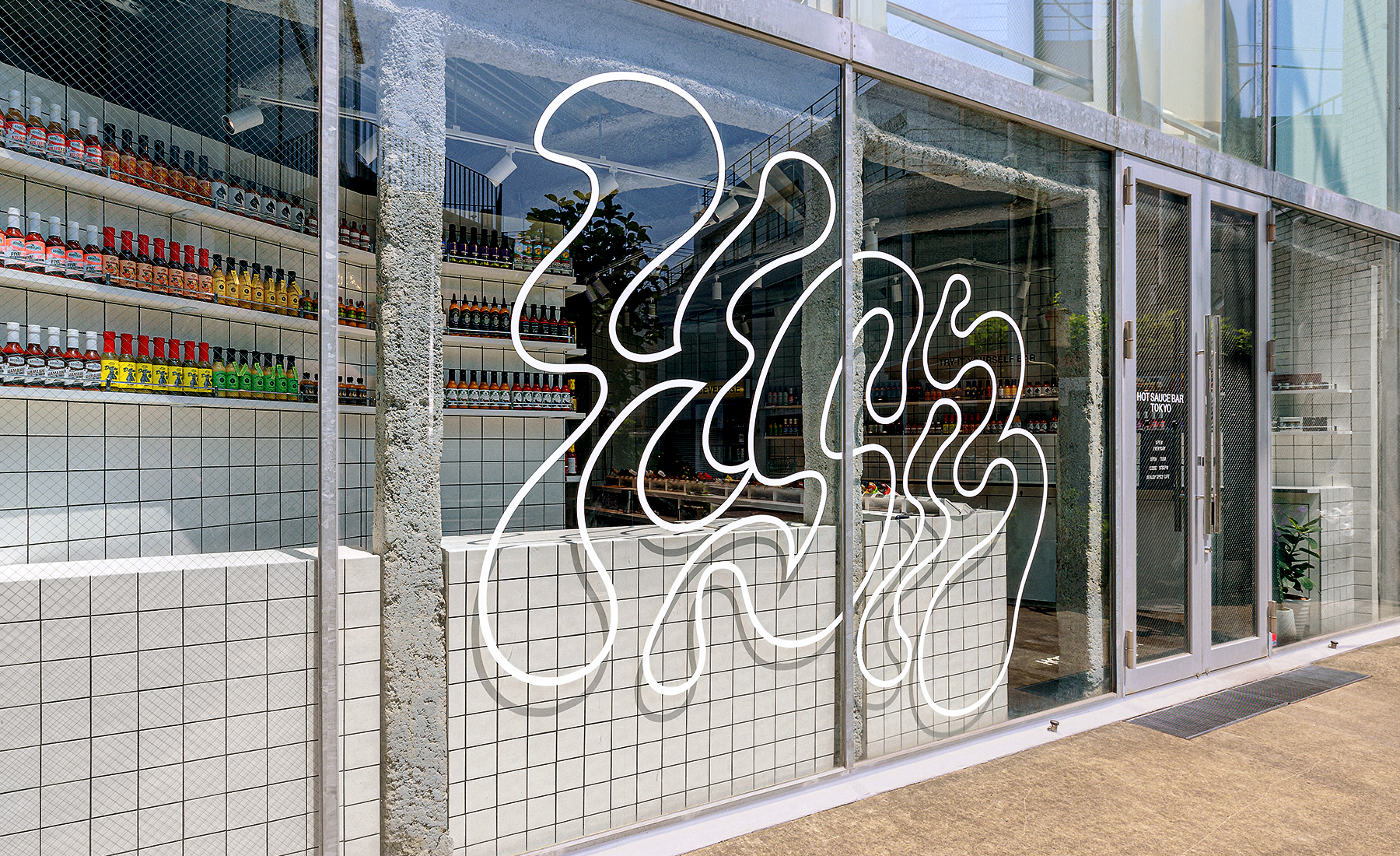
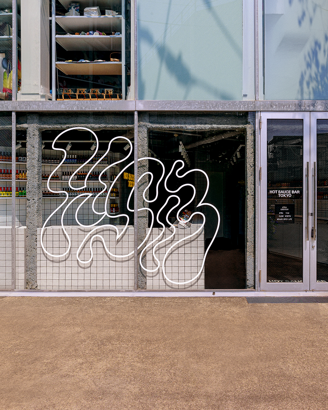
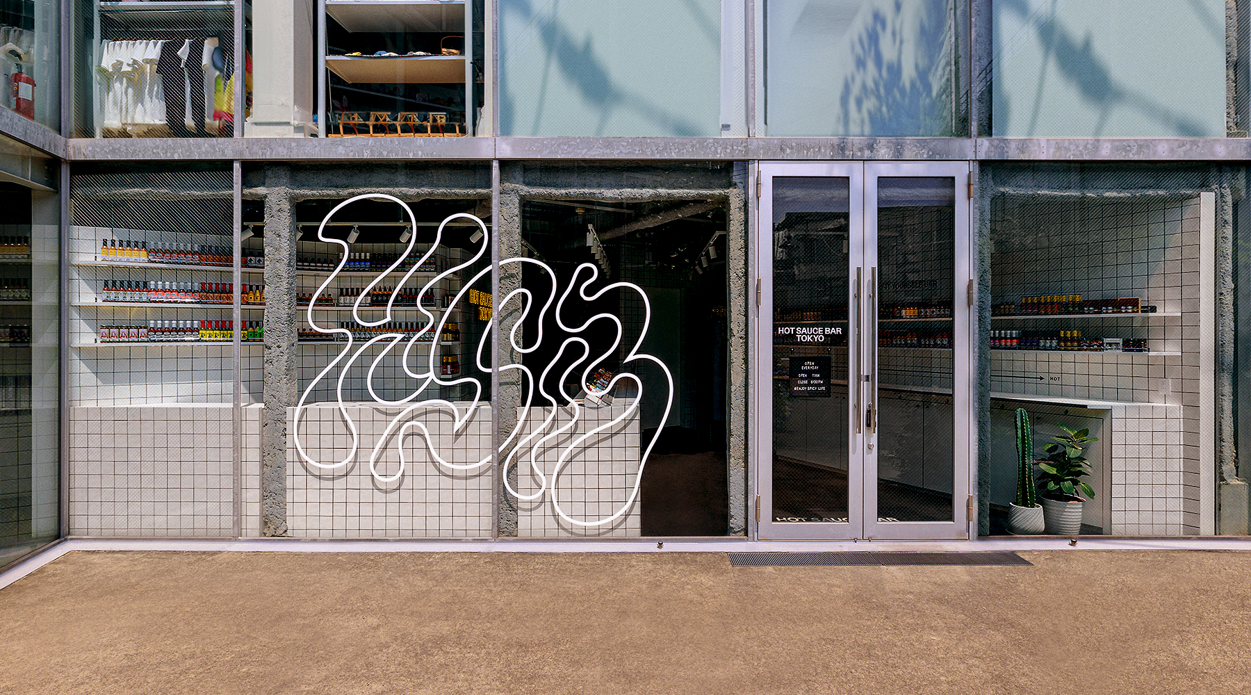
Hot Sauce Bar is Japan’s first curated craft hot sauce brand, bringing together bold, small-batch sauces from around the world. I originally designed the brand identity in 2019, and in 2025, revisited and refreshed it for the opening of the brand’s first physical store in Tokyo.
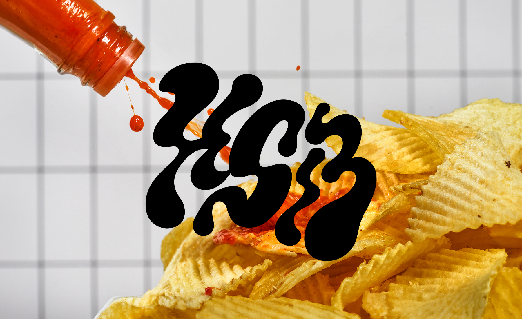
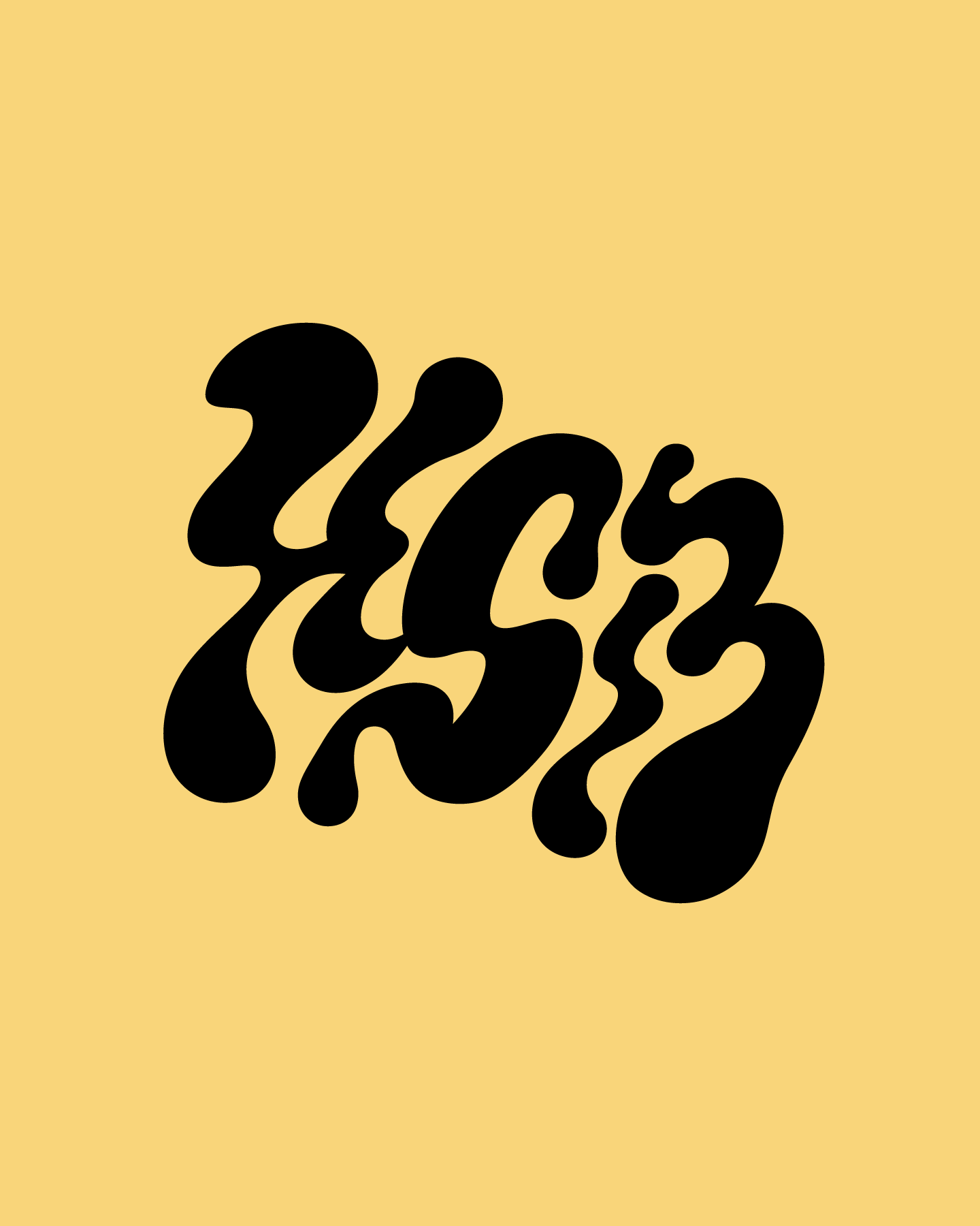
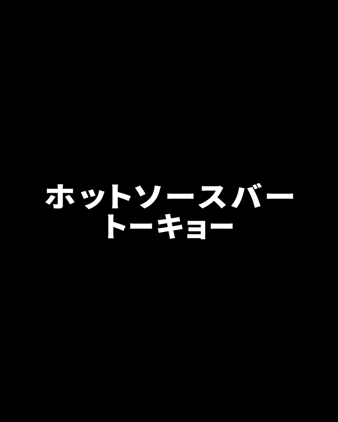
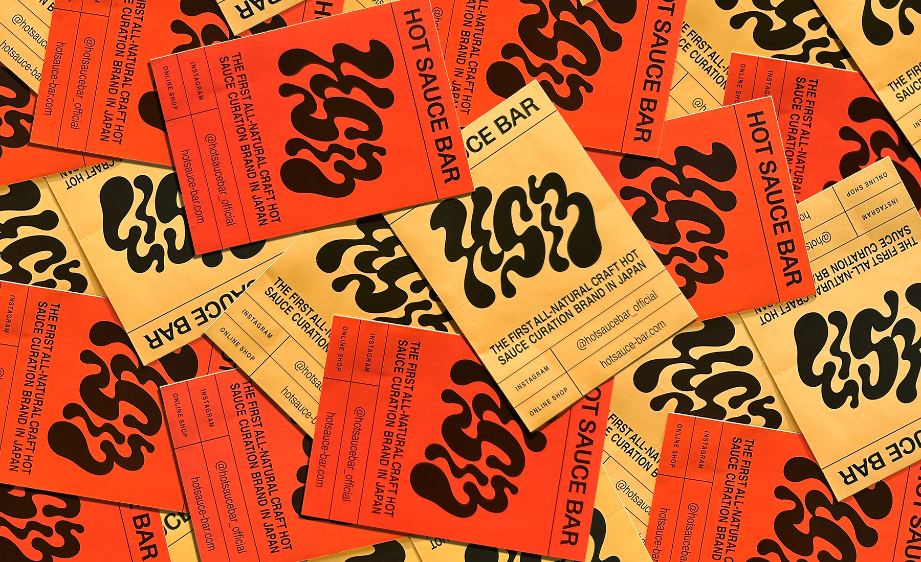
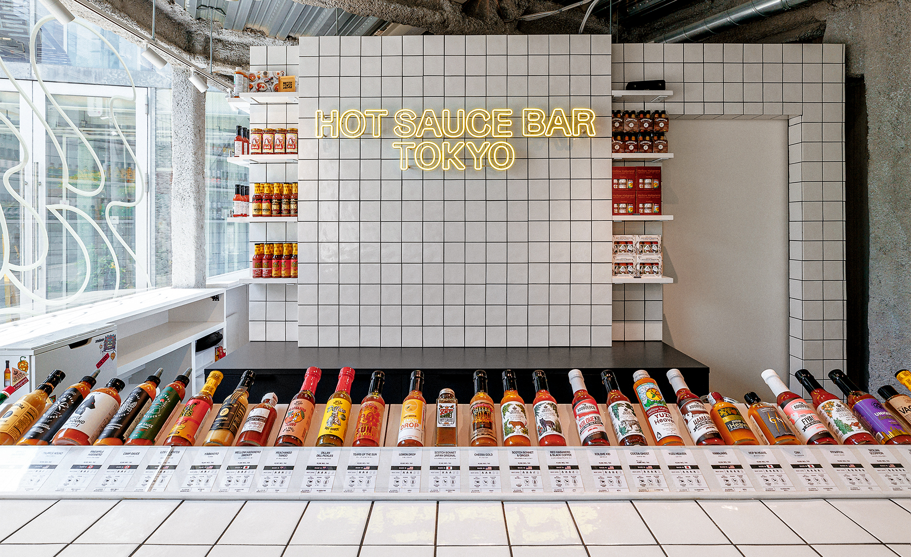
To reflect the brand’s friendly, curious spirit—with a dash of heat—I reimagined the logo using the initials “HSB,” drawing inspiration from the dynamic splash of hot sauce while subtly nodding to the original design. I also created a new logo for “Hot Sauce Bar Tokyo” and built an expanded visual system, including typography, color palette, and layout templates, to support future growth.
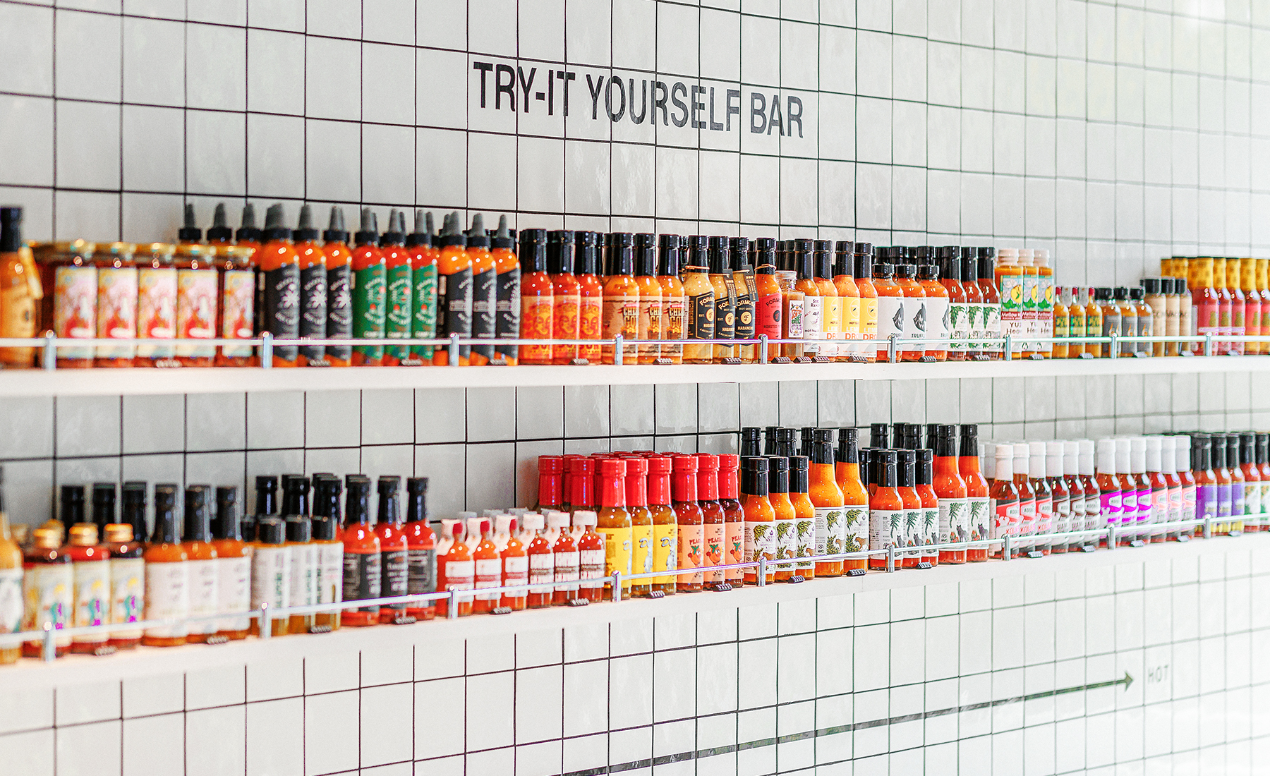
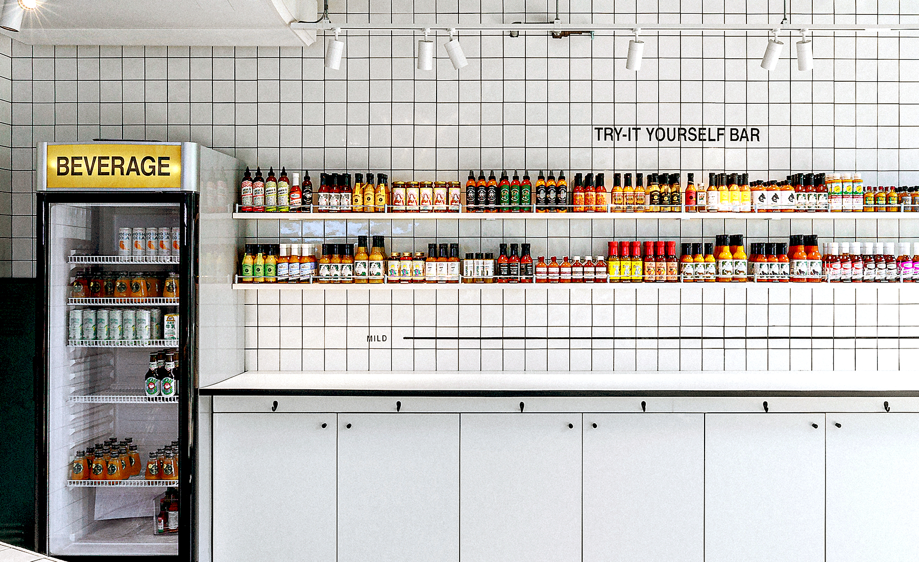
In addition to graphic work, I also consulted on key interior design decisions to ensure the spatial experience aligned with the refreshed identity—proposing full-tile walls to enhance the sense of quality, and recommending a darker floor tone for visual grounding.
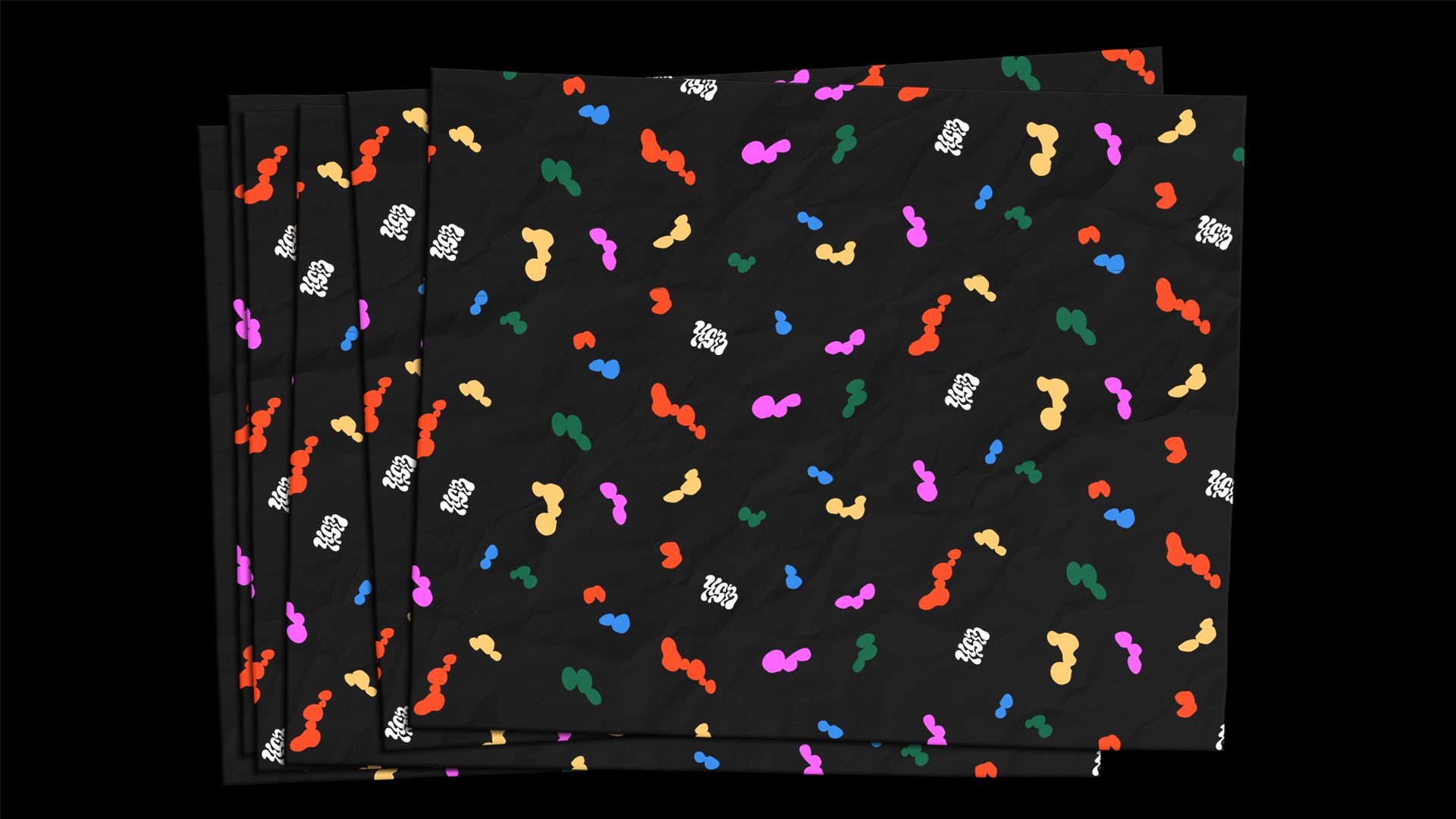
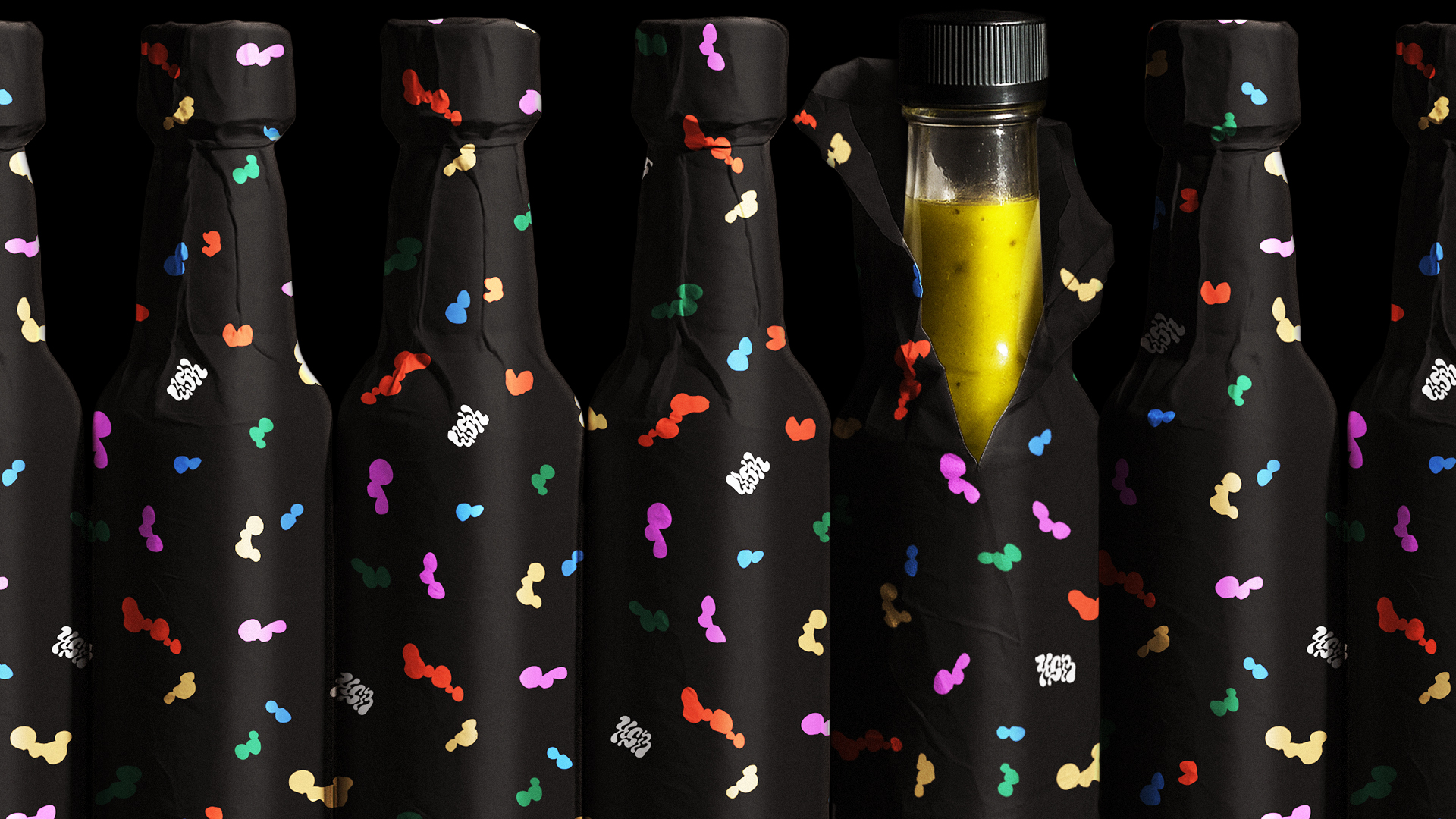
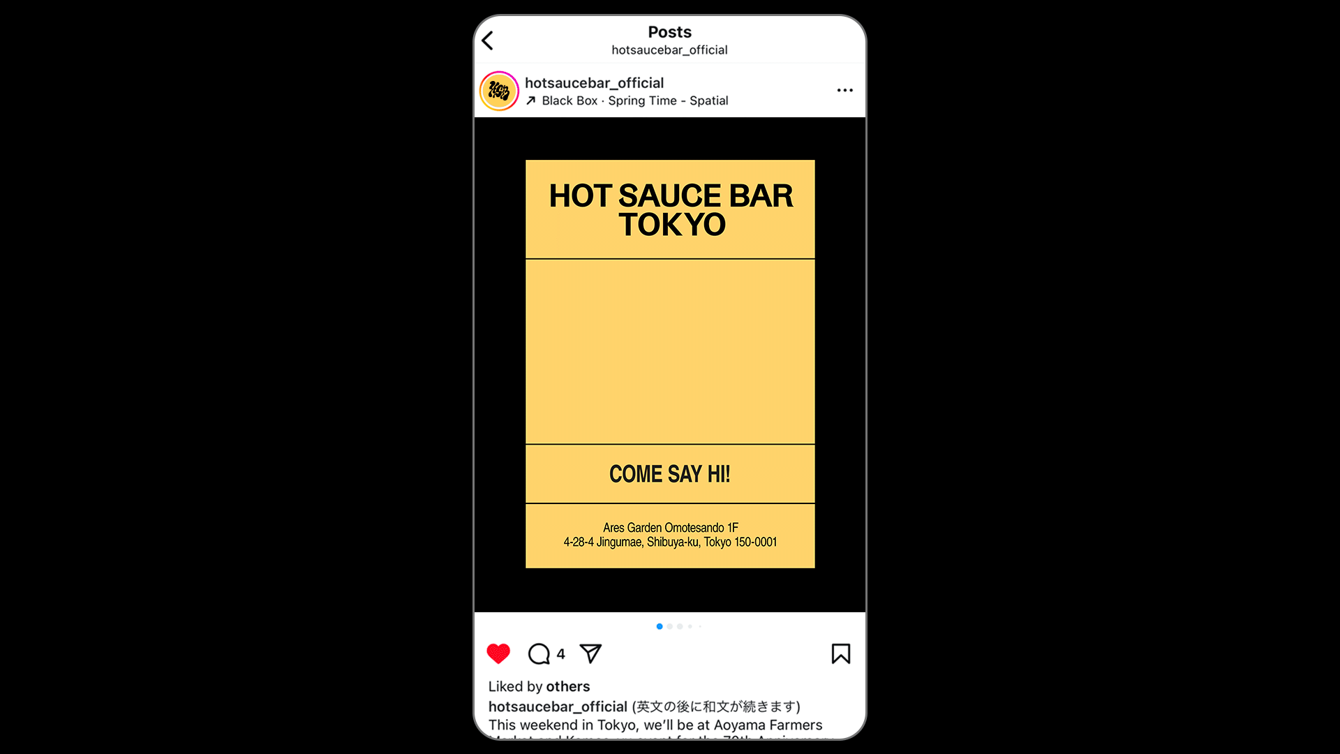
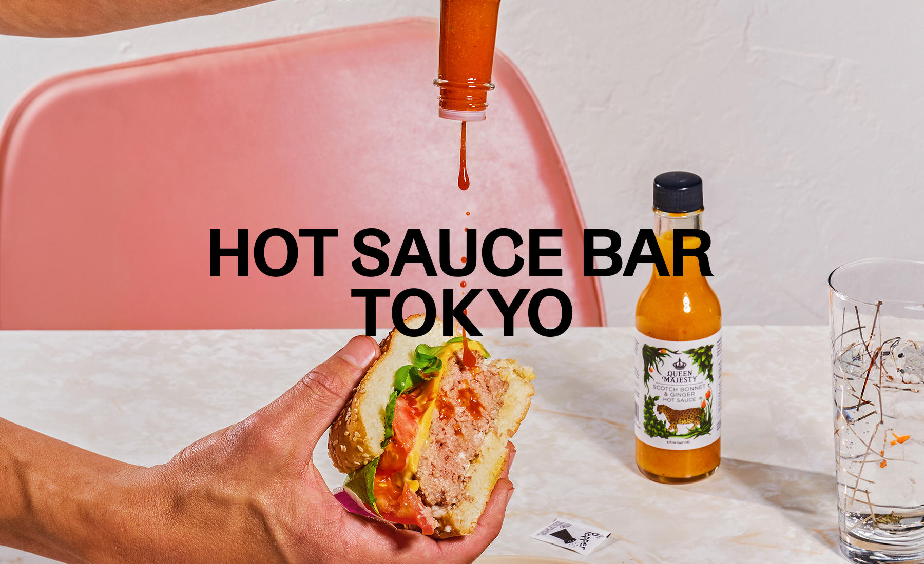
The updated identity captures the thrill of discovering unexpected global flavors, balancing warmth with a playful bite. I also designed a range of physical and digital launch assets, from signage and wrapping paper to stickers and social media visuals.
Hot Sauce Barは、日本初のクラフトホットソース専門のキュレーションブランドで、世界中の個性豊かなスモールバッチソースとの出会いを届けています。ブランドが立ち上がった2019年にロゴを含む初期のビジュアル・アイデンティティを手がけ、2025年に東京初の実店舗オープンに合わせてリフレッシュを担当しました。
ブランドの親しみやすく好奇心をくすぐるスピリットに、ホットソースらしいピリッとしたエッジを加えた世界観を目指し、ホットソースが飛び散る瞬間のダイナミックな動きから着想を得て、“HSB”の頭文字で元のデザインのエッセンスも受け継ぎつつロゴを再構築しました。また「Hot Sauce Bar Tokyo」のロゴも新たに開発し、タイポグラフィ、カラーパレット、レイアウトテンプレートなど、今後のブランド拡張に対応できるビジュアルシステムを構築しました。
グラフィックに加えて、内装面にも部分的にアドバイスを行い、リブランディング後の世界観と空間体験が一致するよう配慮しました。たとえば、壁にグラフィックを貼るよりも素材で高級感を出すことを提案し、全面タイル張りの壁や、空間に重心を与える暗めの床色を提案しました。
リフレッシュされたアイデンティティは、思いがけない世界のフレーバーとの出会いのワクワク感を表現しつつ、あたたかさと遊び心のバランスを持たせています。実店舗立ち上げに伴い、サイネージやラッピングペーパー、ステッカー、SNS用ビジュアルなど、さまざまな印刷物&デジタルのツールもデザインしました。